Original app screens leave room for improvement
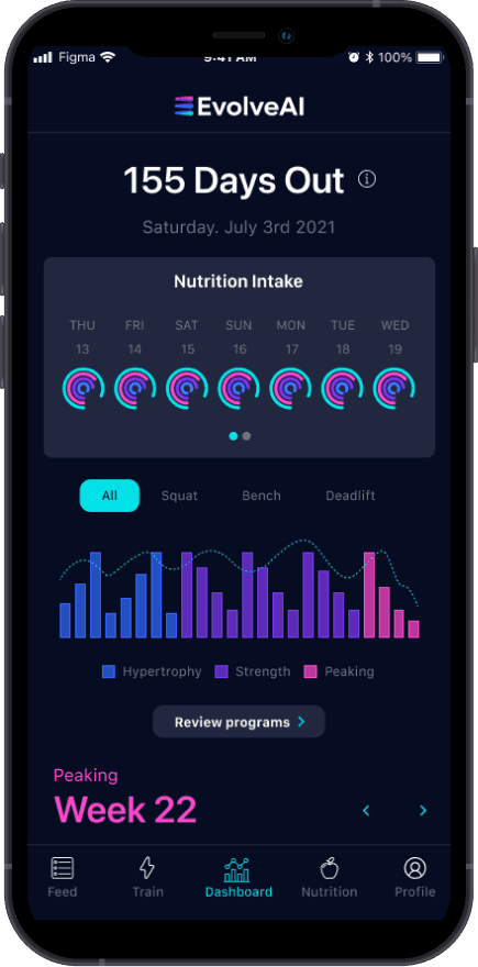
High contrast and vibrating colors. This original dashboard screen shows serves as an overview for training and nutritional intake, but also where the athlete would launch into training.
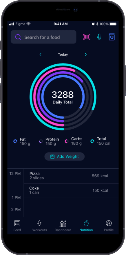
Daily nutrition view. Note that actual food logging is restricted to ~25% of screen space.
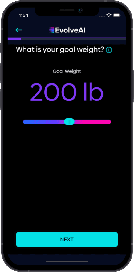
Onboarding shows the bold usage of cyan, magenta, blue, and purple.
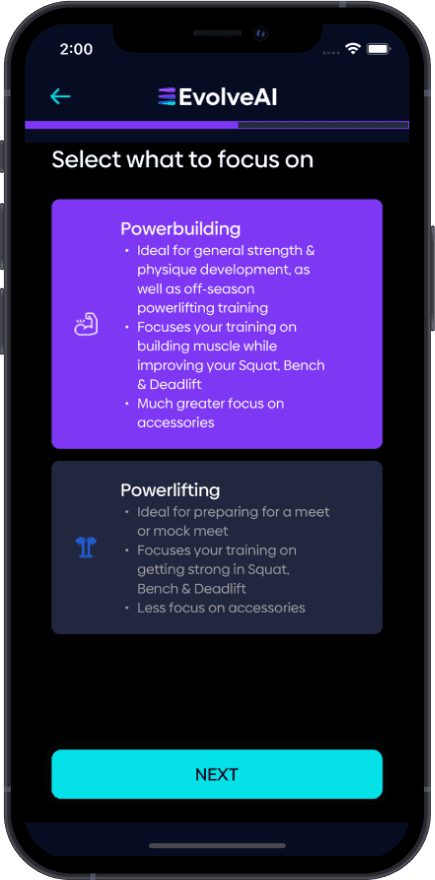
Font selection is stylized but difficult to read at smaller text sizes. Many screens did not pass accessibility guidelines.
Inconsistent button usage. The "1", "2", "3" set numbers are not tappable, but the buttons to the right are. Both are formatted identically.
Lack of visual hierarchy and organization make it hard to for the eye to follow.
This was a large project
As a functional app already in use, there was no design system in place. In some senses this was a blessing as I got to define everything from scratch, covering color, elevation, grids, typography, spacing, components, iconography, and plenty more.
Phase 1
Reskin & Minor UI Updates
Evolve sought to make their product visually distinct from the marketplace. This phase includes design system & component creation, and overhauling all app screens.
DESIGN SYSTEM
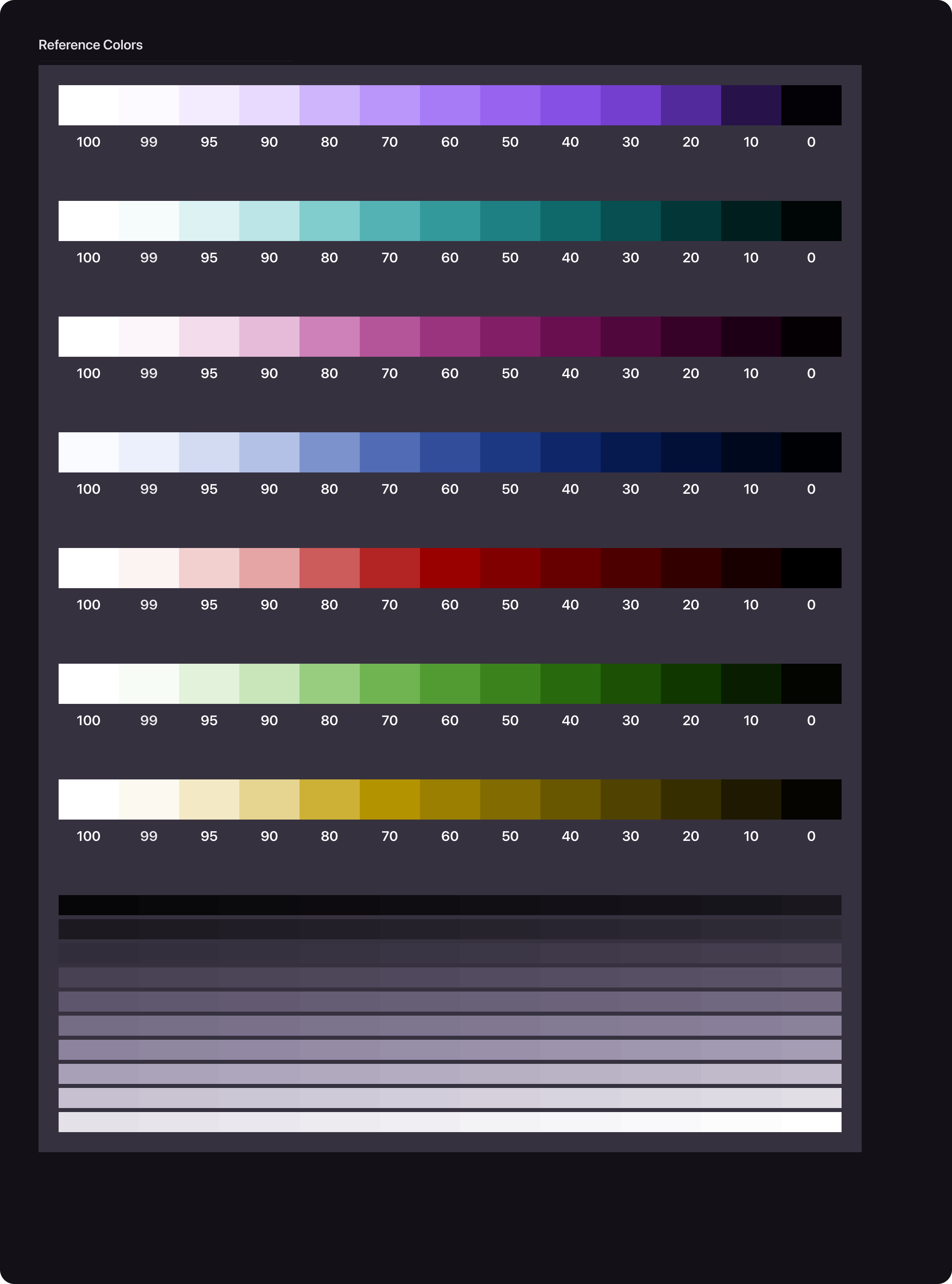
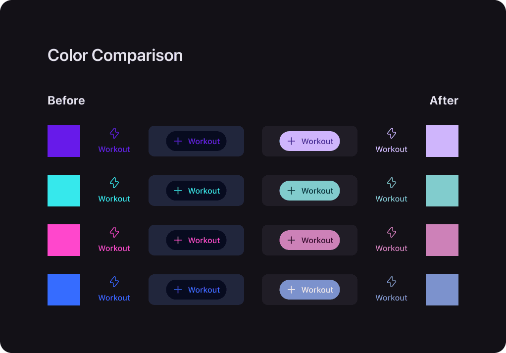
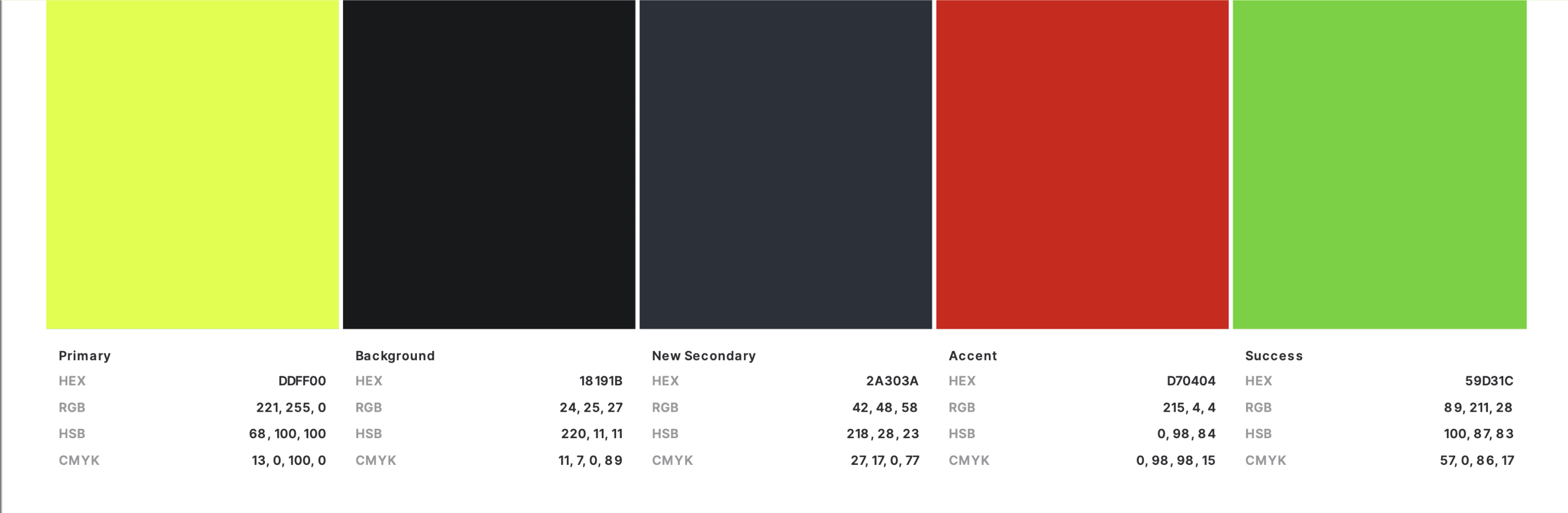
Color
Color underwent a large transformation. Following Google’s Material Design 3 principles, I built a color scheme from scratch, working from their previous brand colors to colors that are more versatile and pass contrast guidelines. Previous high-contrast colors "vibrated", causing a displeasing feeling especially on dark backgrounds.

DESIGN SYSTEM
Typography
Besides using and correctly sizing system fonts, I added one accent font to suit the brand in both display purposes, and for web and social media.

Neue Machina has those lovely inktraps that give the brand an approachable but futuristic feeling.

Subtle differences are visible between operating systems, useful in prototying.
DESIGN SYSTEM
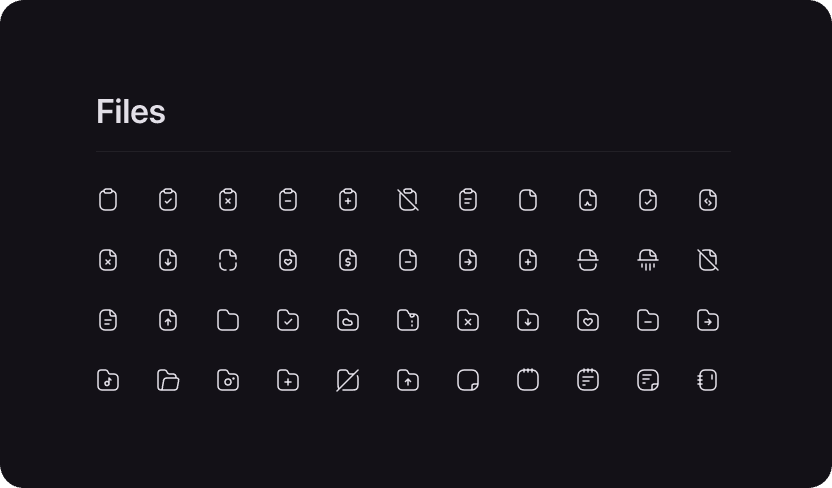
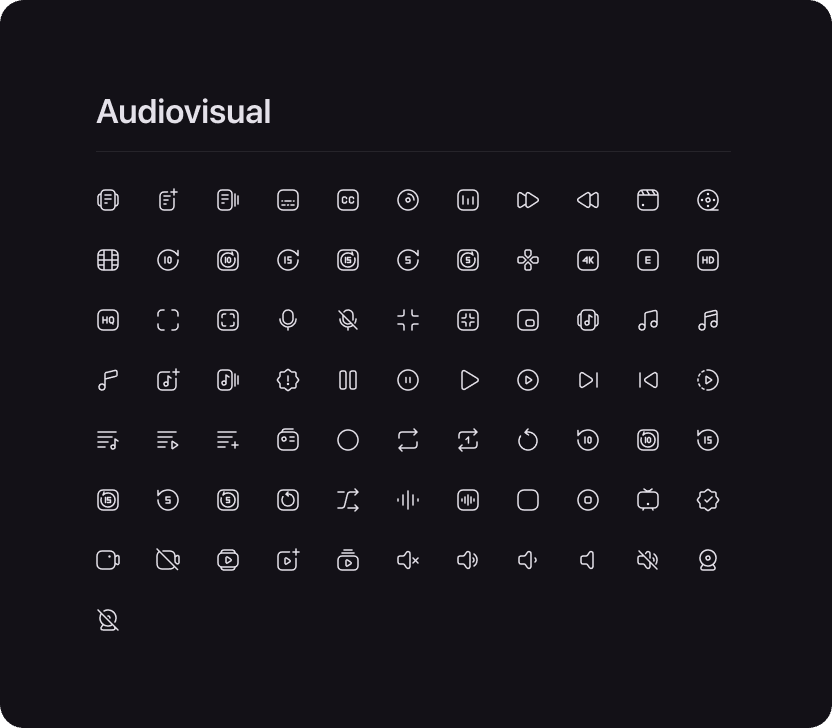
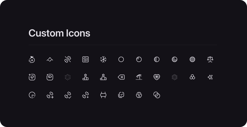
Icons
This project required the creation of some two dozen new icons to solve communication problems, and in keeping with the visual treatment of the original icon system.


DESIGN PHASE
Reskinning
Following the creation of the design system, I began implementing this in a thoughtful way, carving a path for future features while keeping as low a development time as possible.


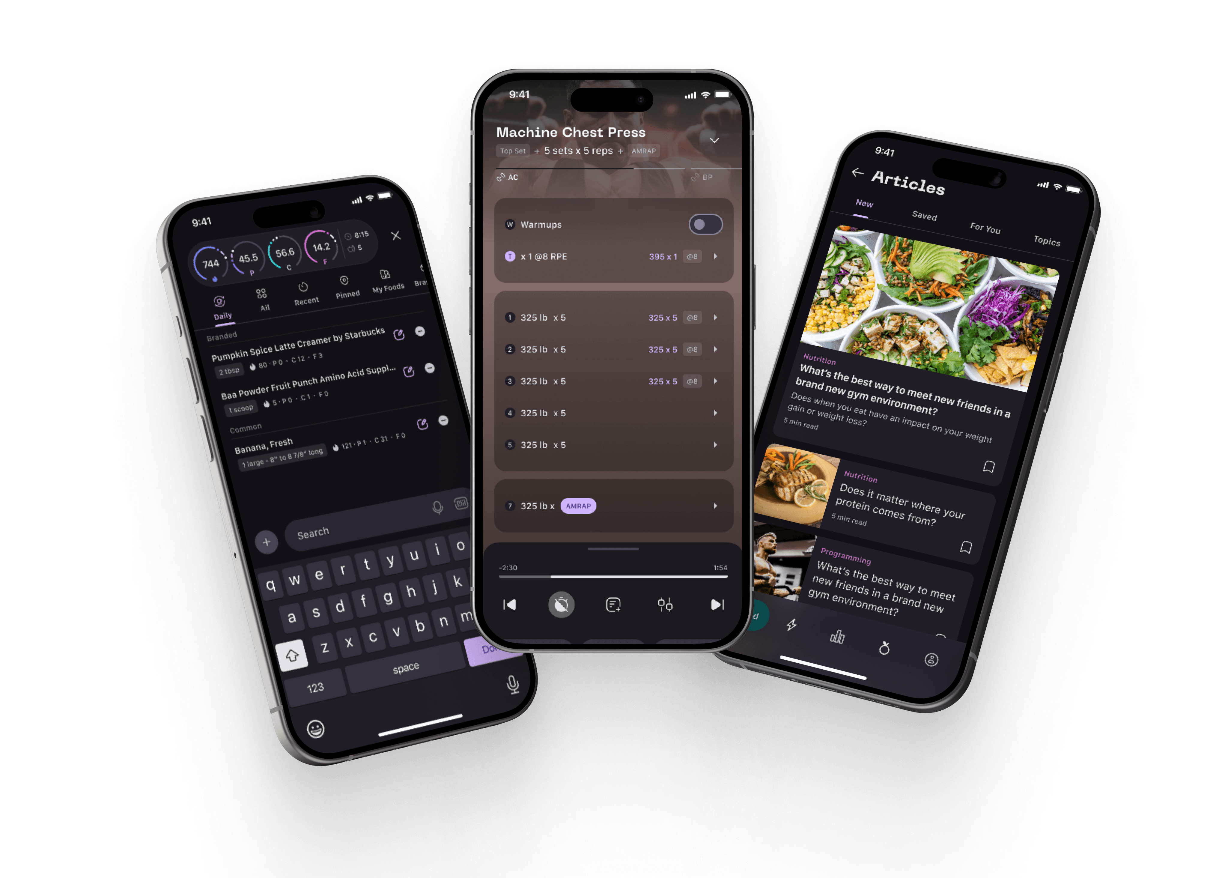
Dashboard - Before
Early dashboard that combines a nutrition and training overview and also served as the only place to launch into a workout.
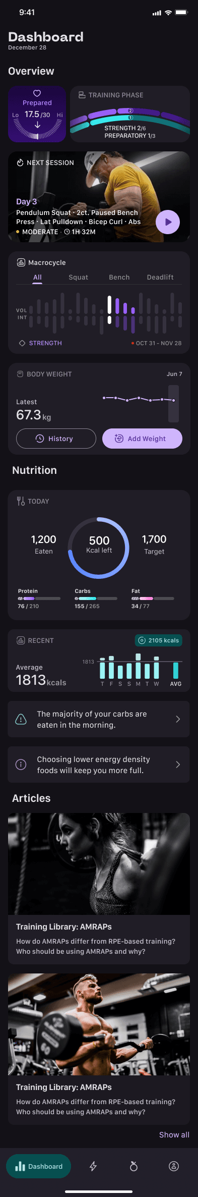
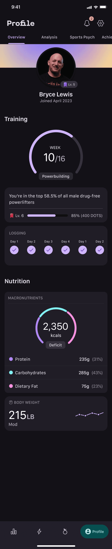
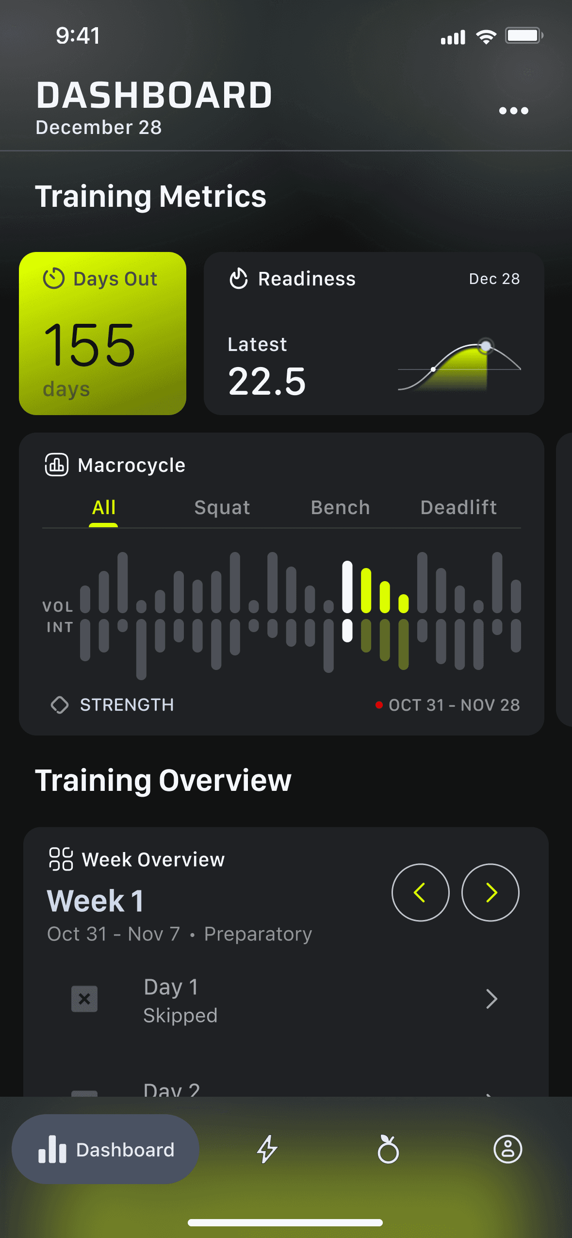
Dashboard - After
By removing the logo in the top left, we make room for page identification. Moving to a container-style bento grid, I set the stage for later user customization.
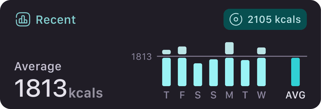
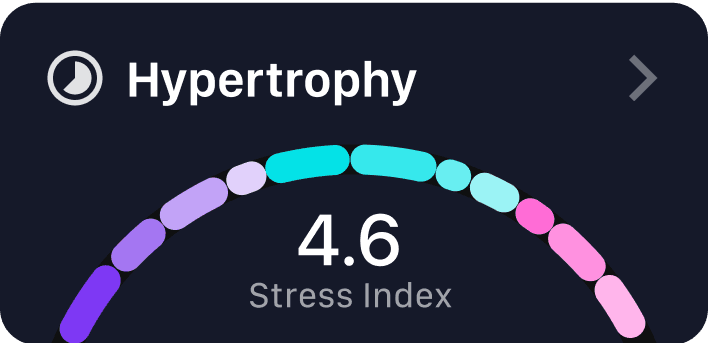
The new dashboard is more feature-rich, including widgets for body weight, today’s nutrition overview, AI-based advice on nutrition, and articles tailored to the user.
Dashboard - Before
Early dashboard that combines a nutrition and training overview and also served as the only place to launch into a workout.
Dashboard - After
By removing the logo in the top left, we make room for page identification. Moving to a container-style bento grid, I set the stage for later user customization.
The new dashboard is more feature-rich, including widgets for body weight, today’s nutrition overview, AI-based advice on nutrition, and articles tailored to the user.

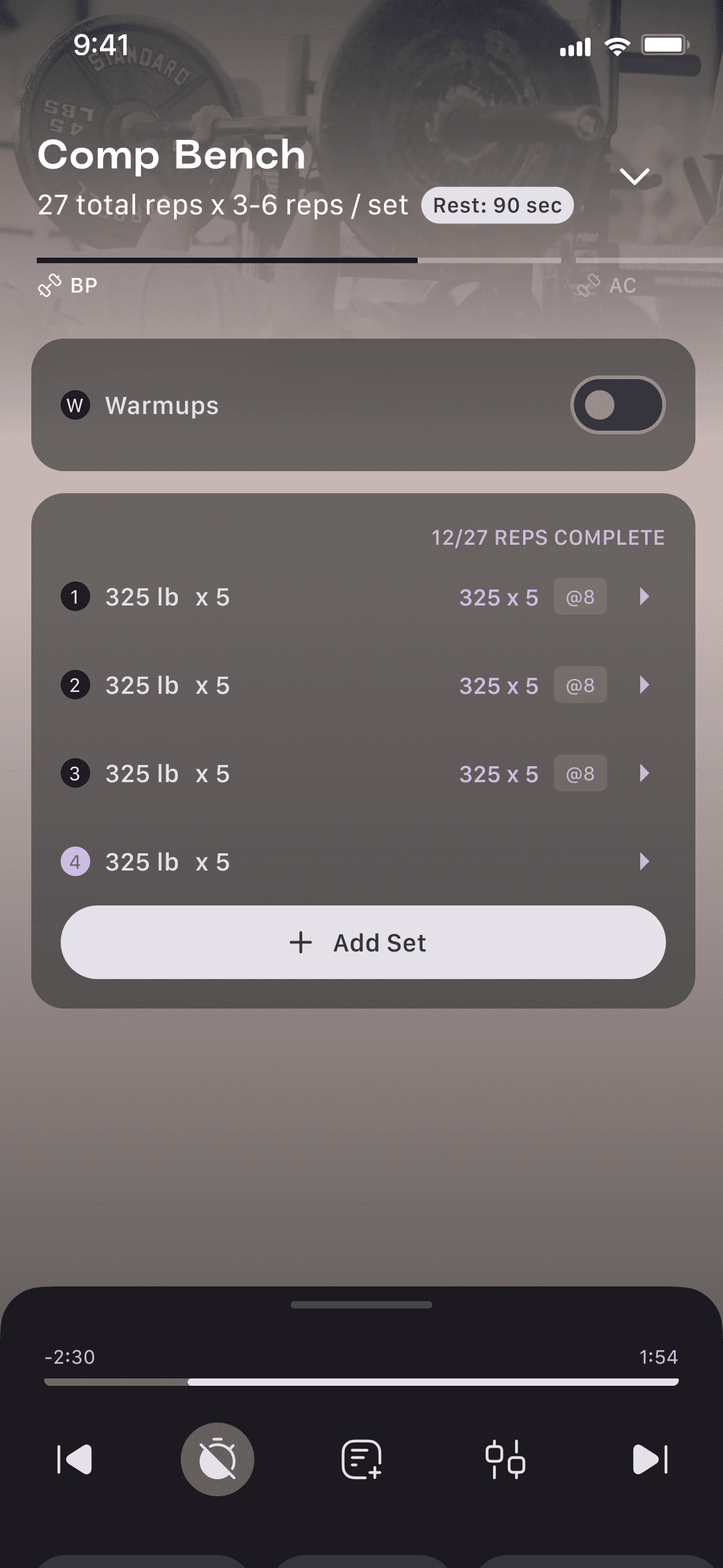
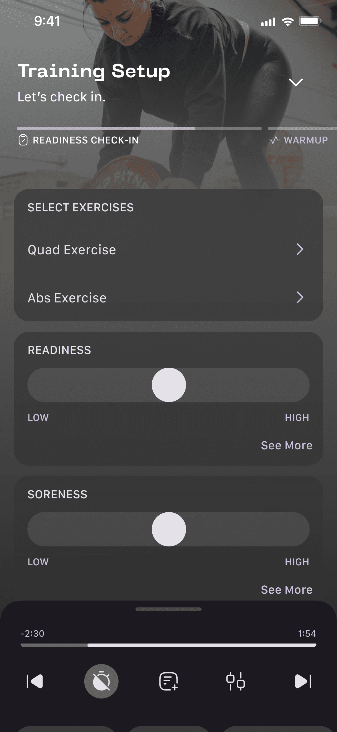
Training - Before
The default training screen keeps readiness values on screen at all times, reducing screen space for exercises. There is no distinction between interactive and non-interactive elements, as users cannot tap on the numbers to the left of each training set.
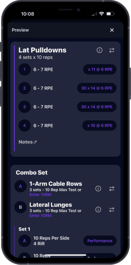
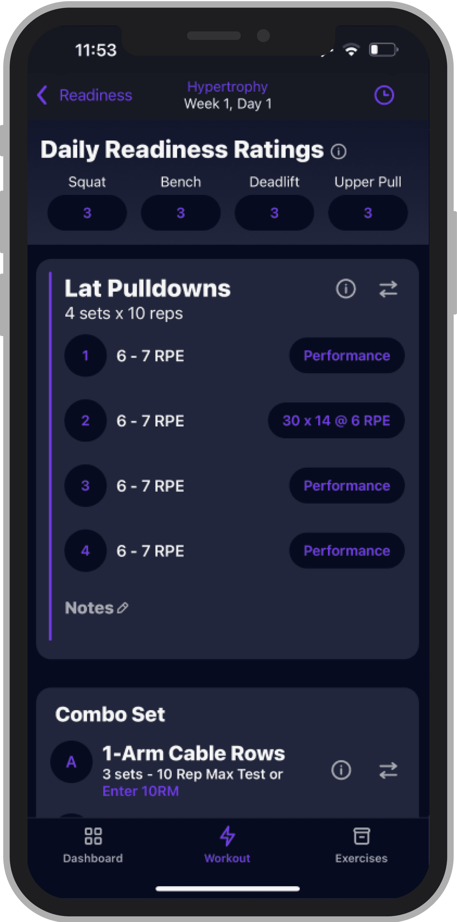
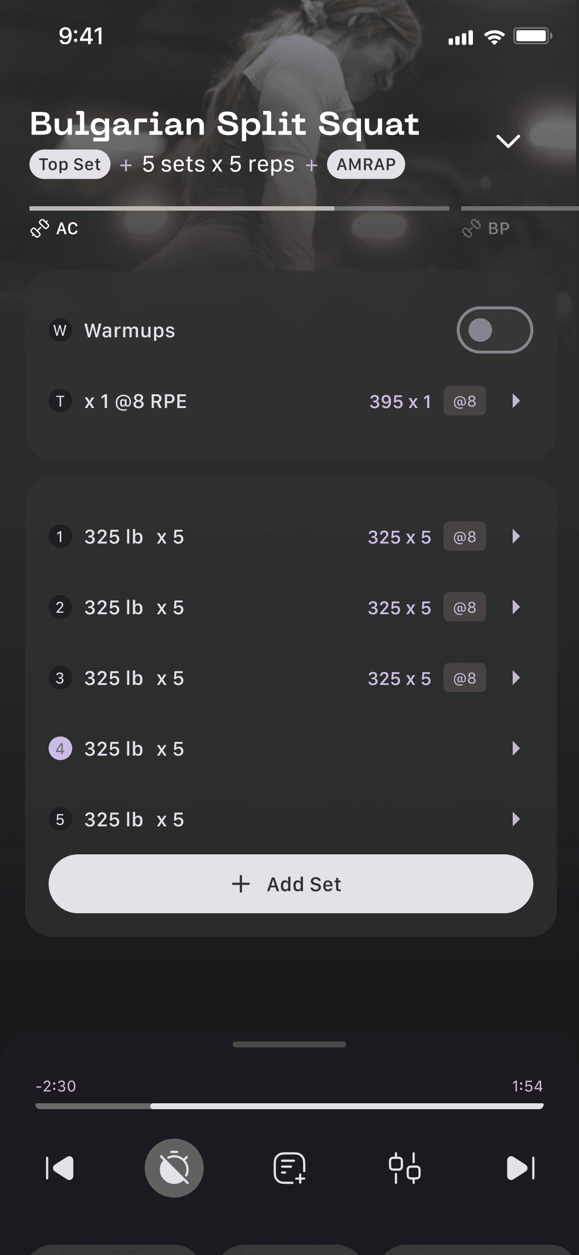
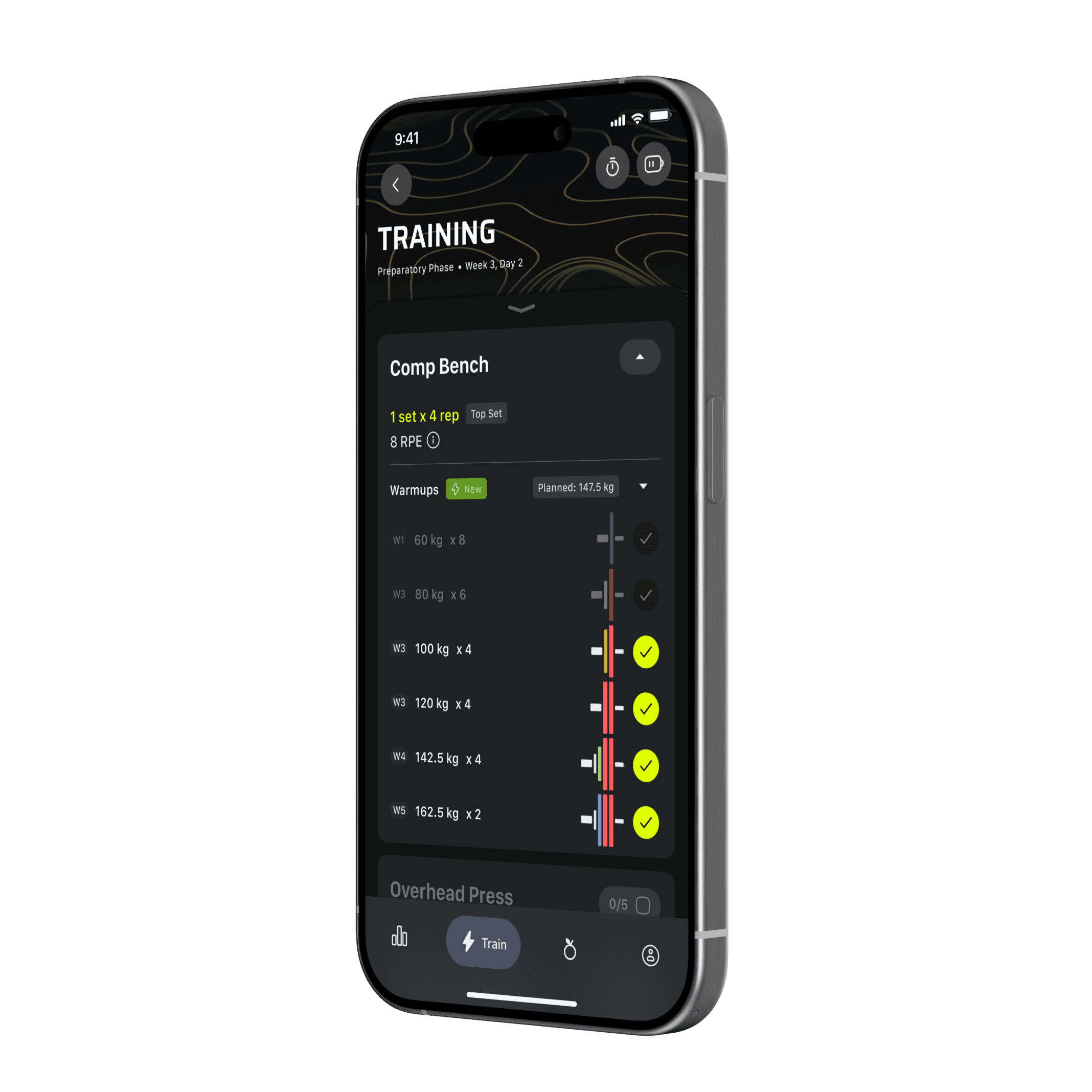
Training - After
Before redesign
By using a bottom sheet, I opened up an area behind the sheet for note-taking or other user-related content. Tracking allows for collapsed states and a counter of completed sets.
There’s better hierarchy of information but otherwise, functionality has been unchanged.
Profile - Before
This early profile screen functioned like a settings page with the only profile information as a name and image.
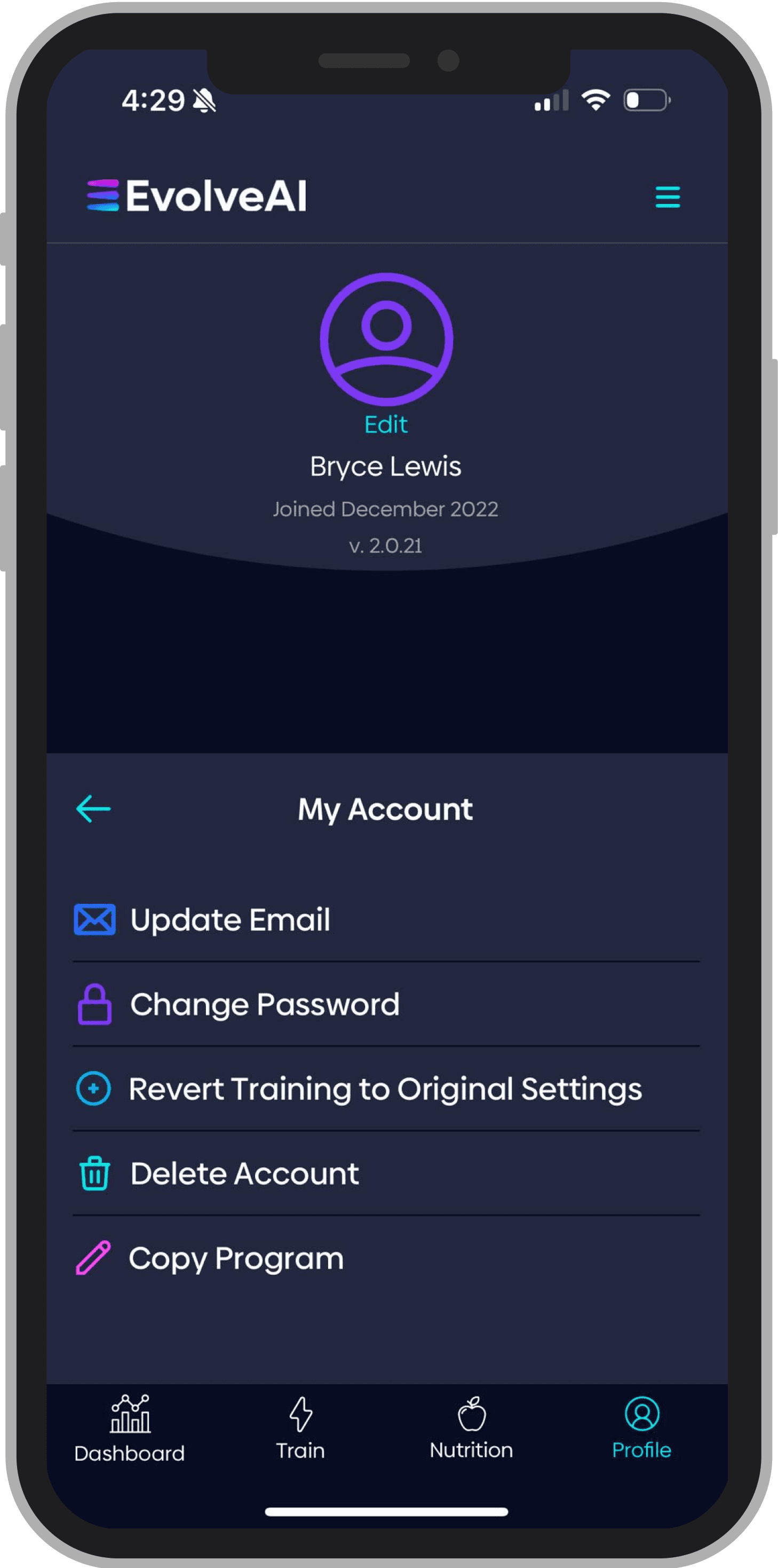
Profile - After
Before redesign
The inclusion of a tab bar allows for many profile-related pieces of information relevant to a gymgoer. I de-emphasized settings by moving it to a gear icon, added a notifications section, rankings to gamify the app, and sections for training and nutrition progress.
Phase 2
New & Existing Feature Development
With a solid foundation, I could begin to push the app forward, creating new interactions, streamlining basic operations and giving users new tools to have a better experience.

User Experience
These features focus predominantly on increasing ease of moving around the app or accessing information.
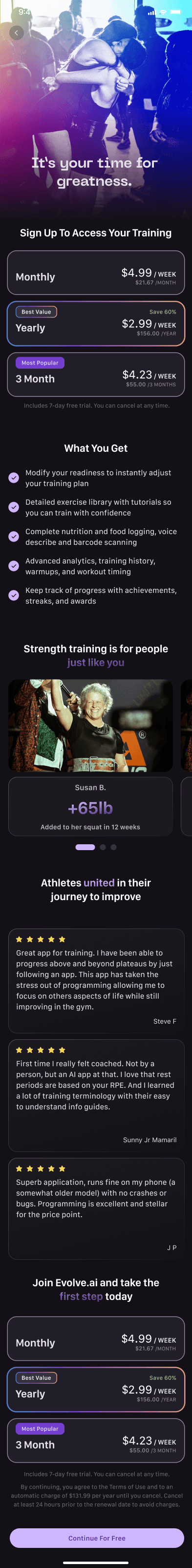
Redesigned onboarding flow
Increased conversion by utilizing user reviews, social validation via progress, a reiteration of features, and a new tiered pricing structure.
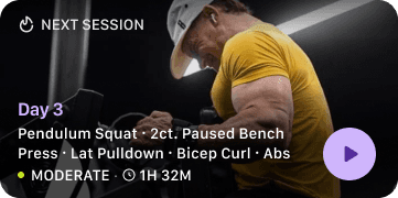
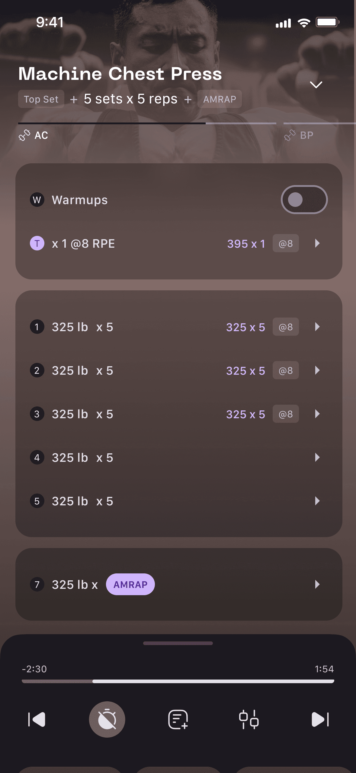
Easily access your next session
Launch into a new workout from the dashboard with a preview of exercises, difficulty, and duration. Difficulty and duration were custom formulas I made.
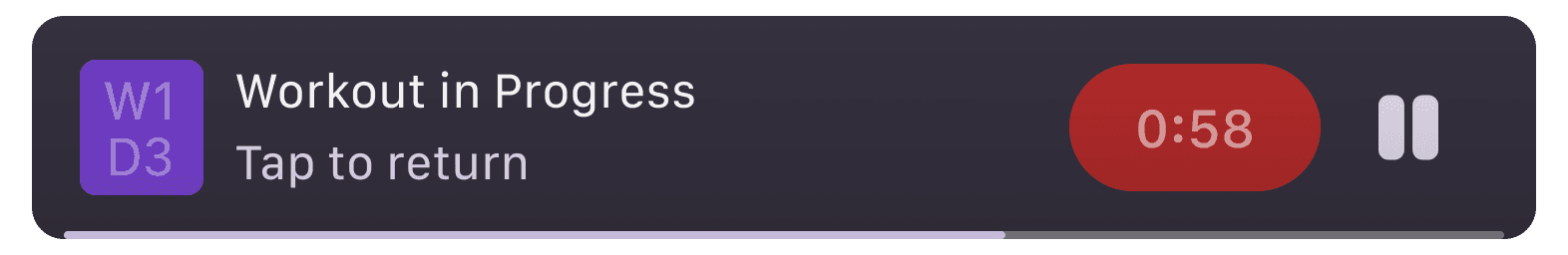
Minimize workout
Allowing for minimize functionality opened up other areas of the app during training sessions and allow for truly full-screen workout tracking.

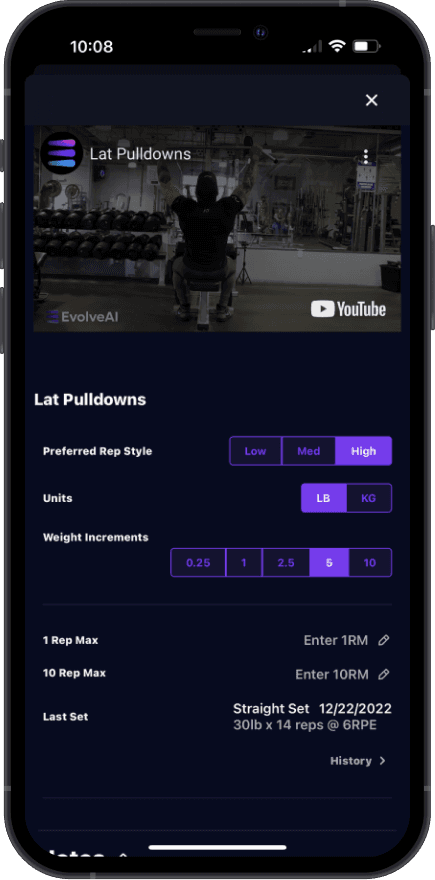
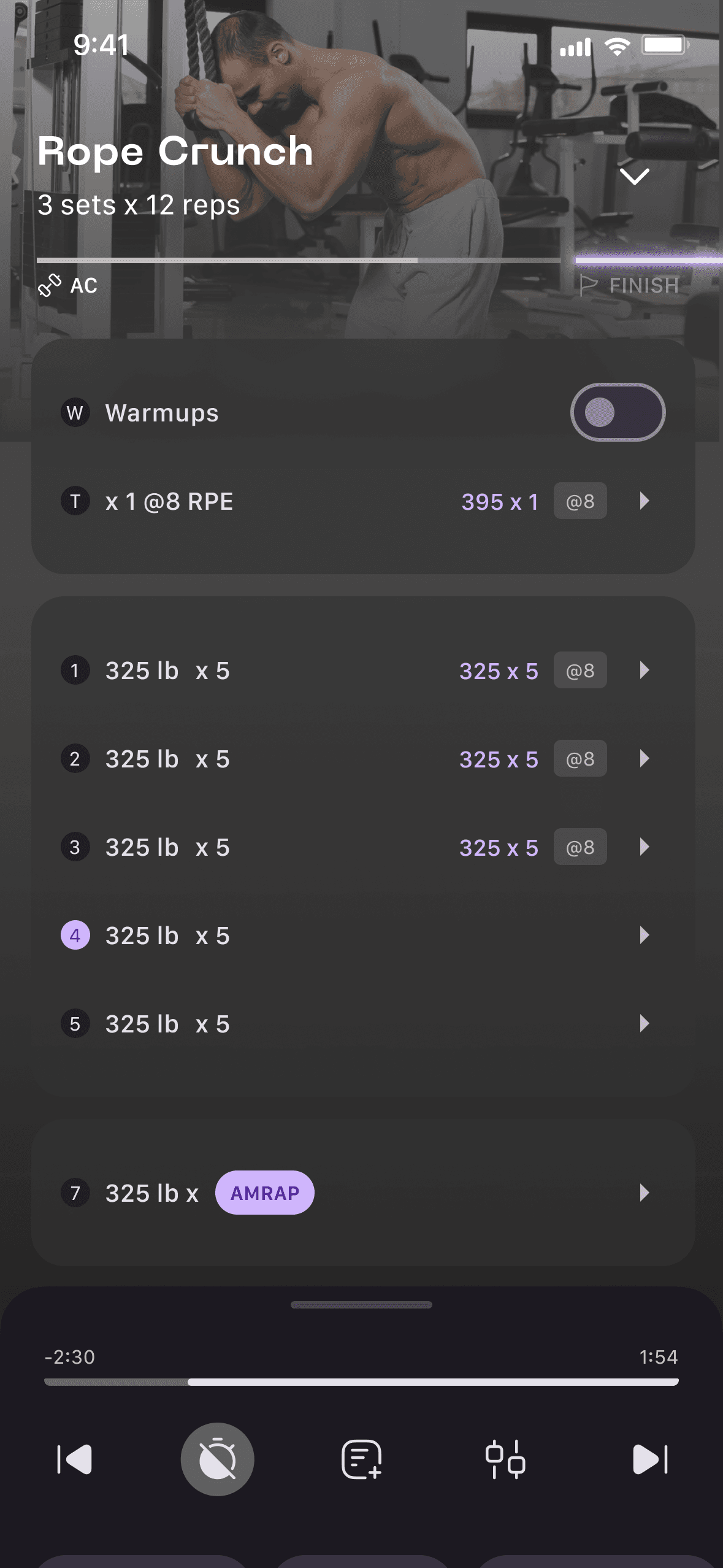
Training home page
Training gets a home page, which allows users a place to find past sessions, view by calendar, and have a timeline-style view of training.
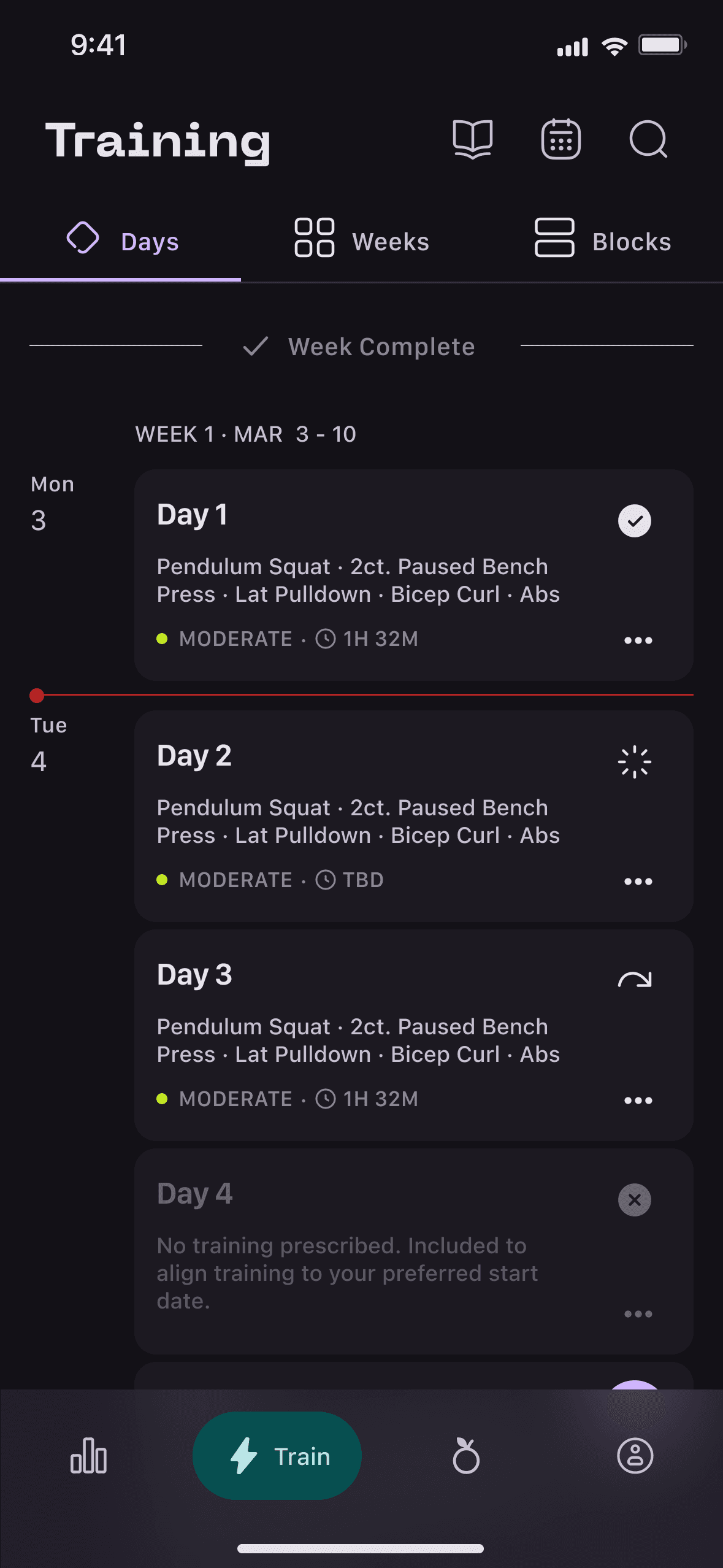
Tap on a training session, week, or month to see a detailed preview
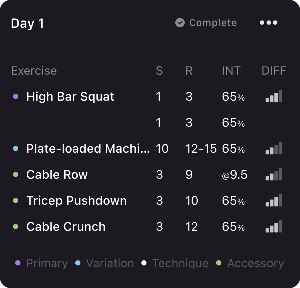
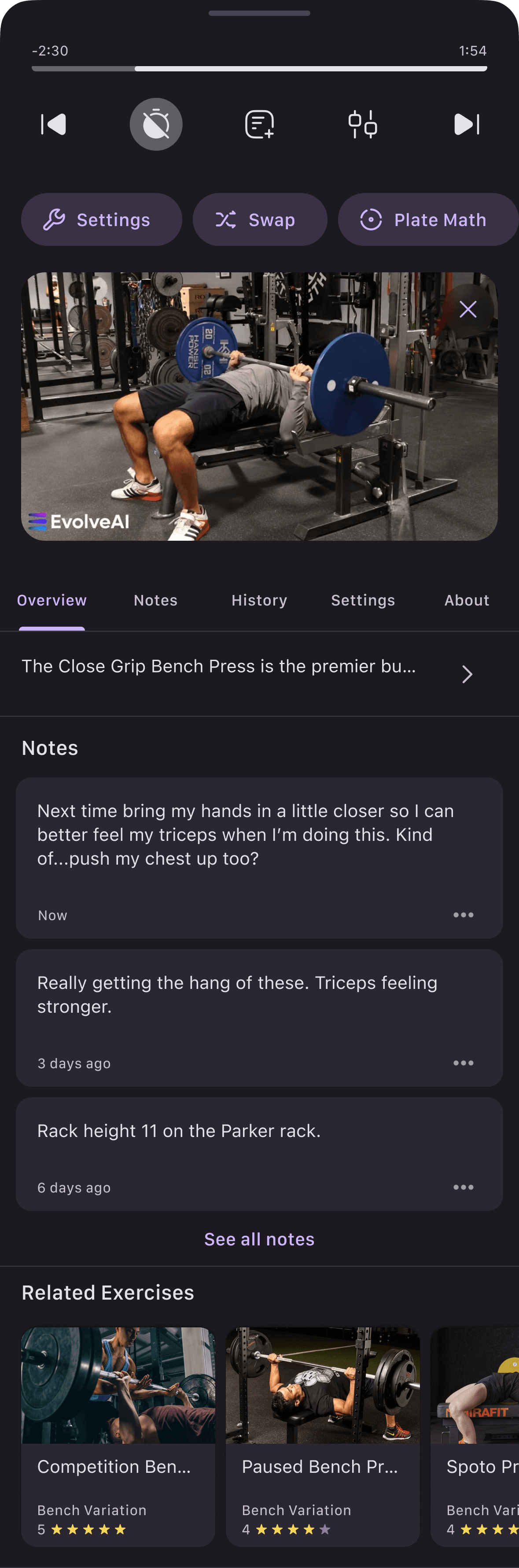
Detail at a glance
See notes, exercise history, settings, and information all while training.
New Features
Ongoing work has also involved the creation of many new brand new features, allowing users to fully engage with their training and nutrition, increasing brand loyalty and satisfaction.
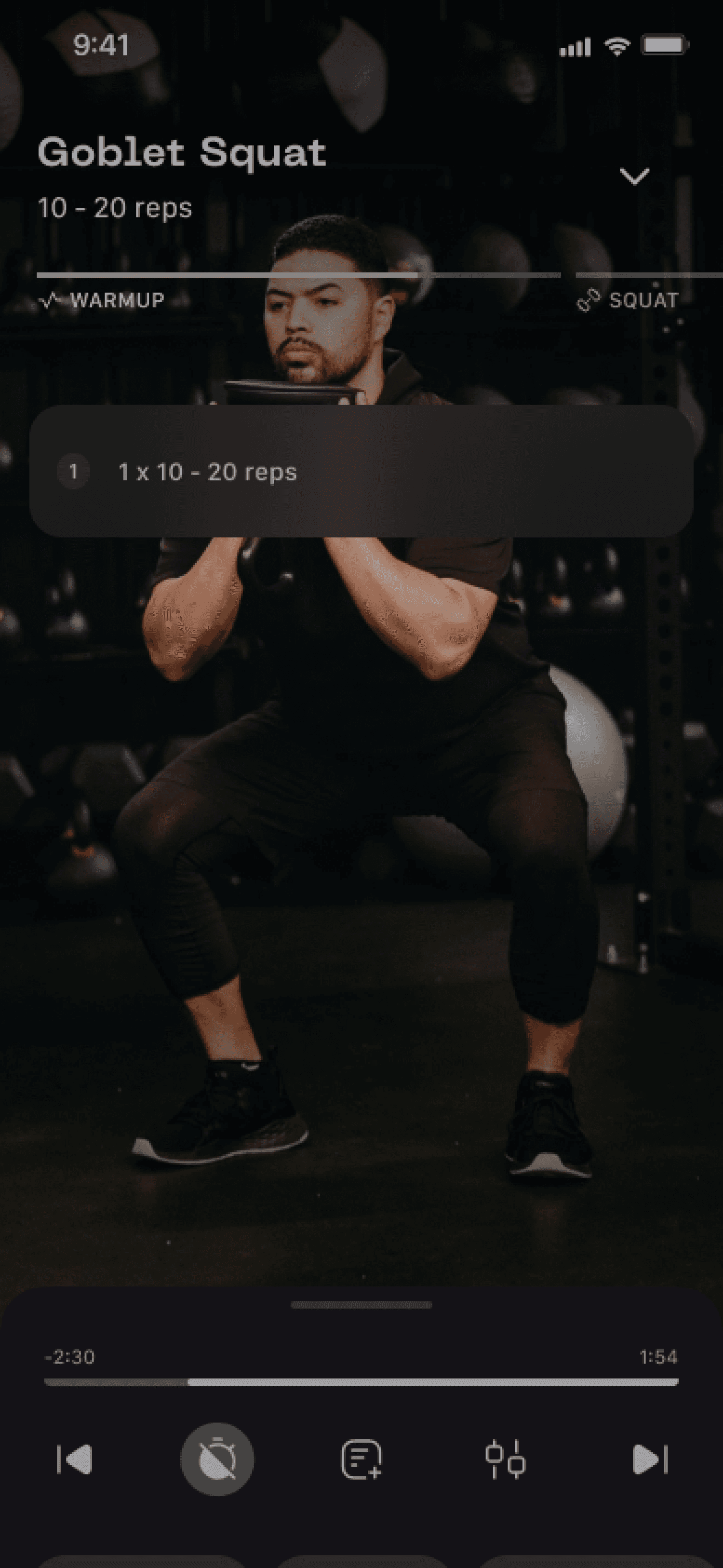
Full Screen Warmups
Videos guide the athlete through effective technique and tempo.
By showing just a single exercise per screen, we can spread information out, reducing information overload and focusing intention.

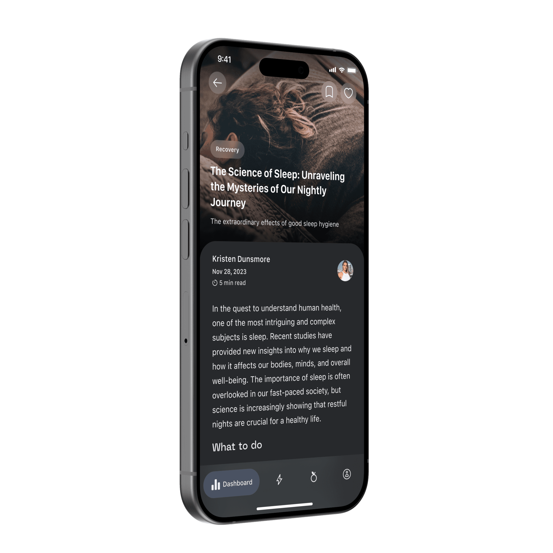
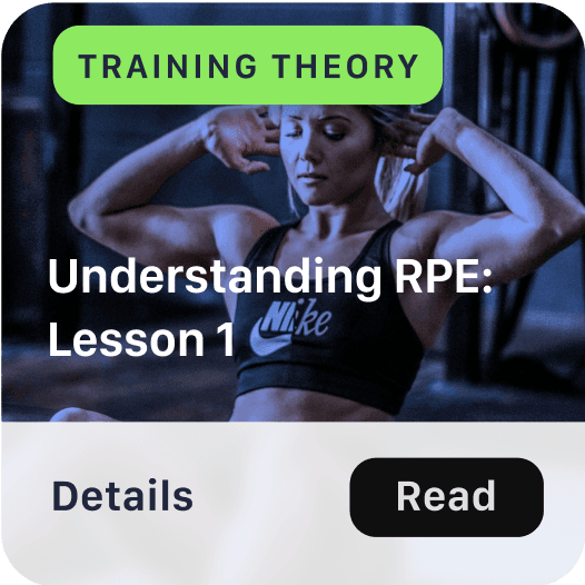
Articles section
Articles built into the app to educate users and add value. This includes the ability to save and sort articles by topic, reducing time to discovery.
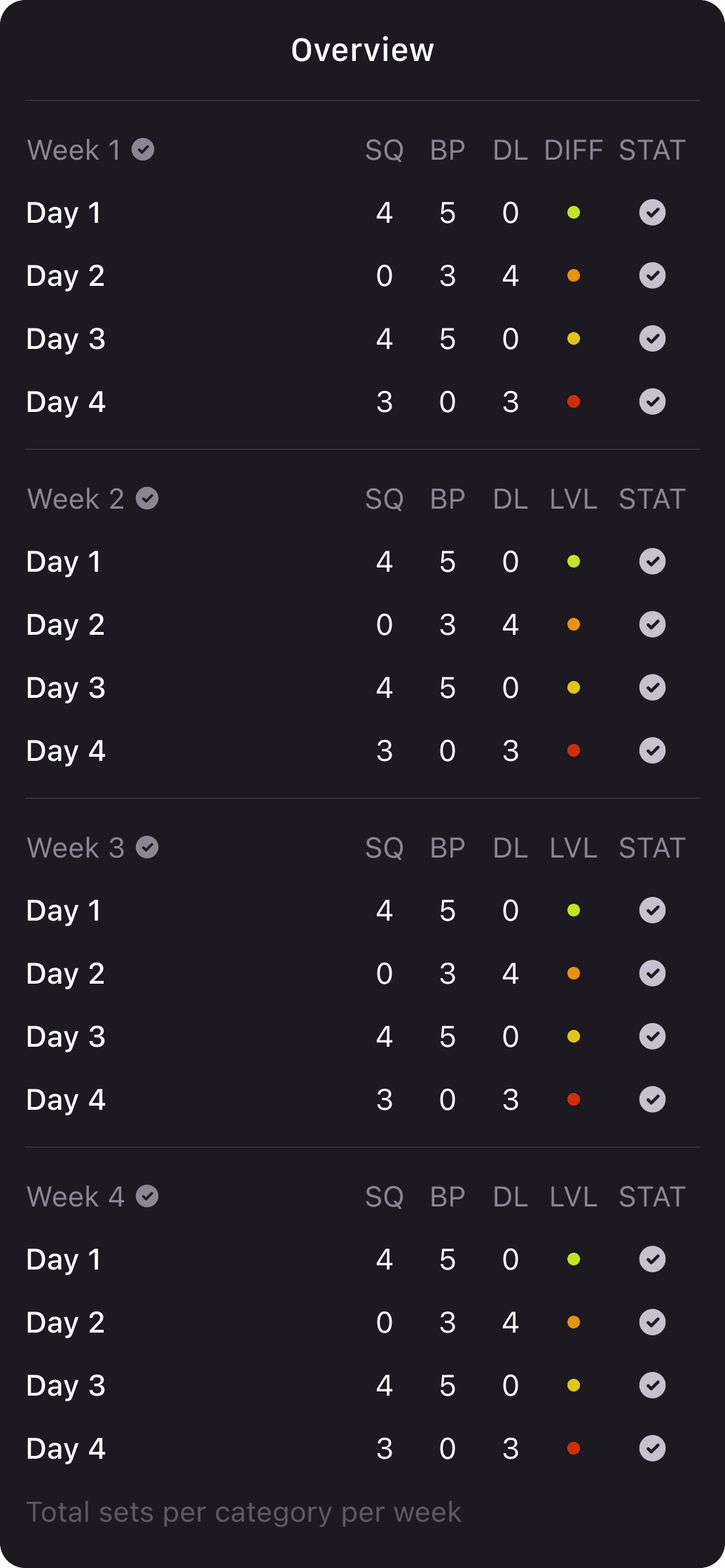
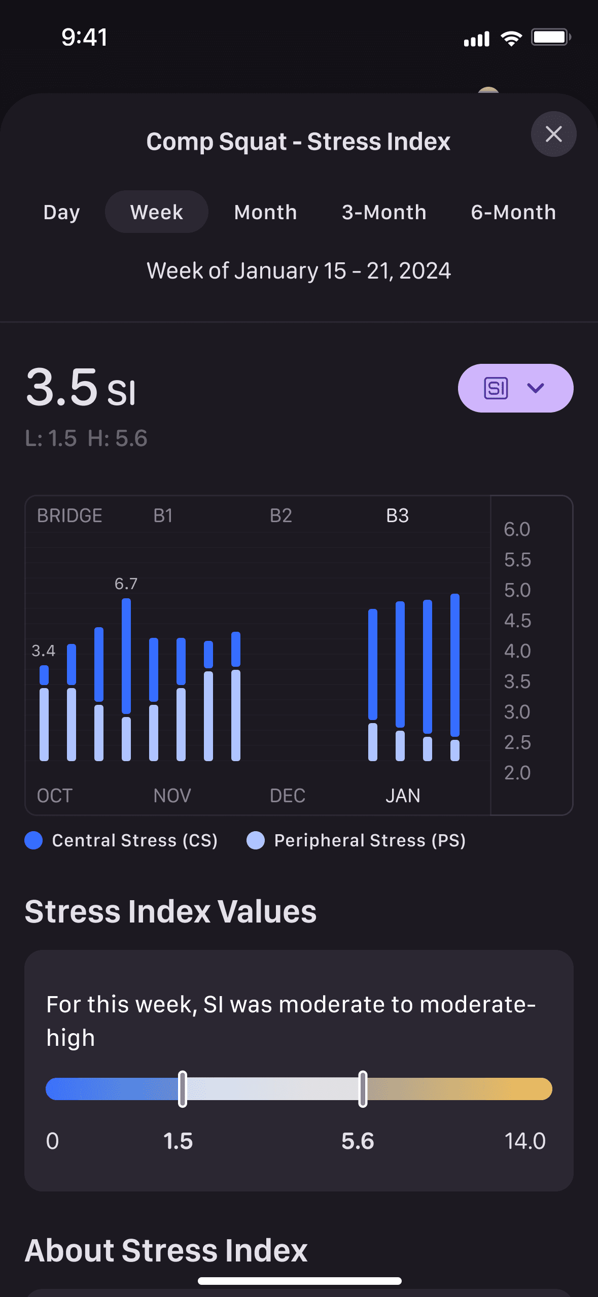
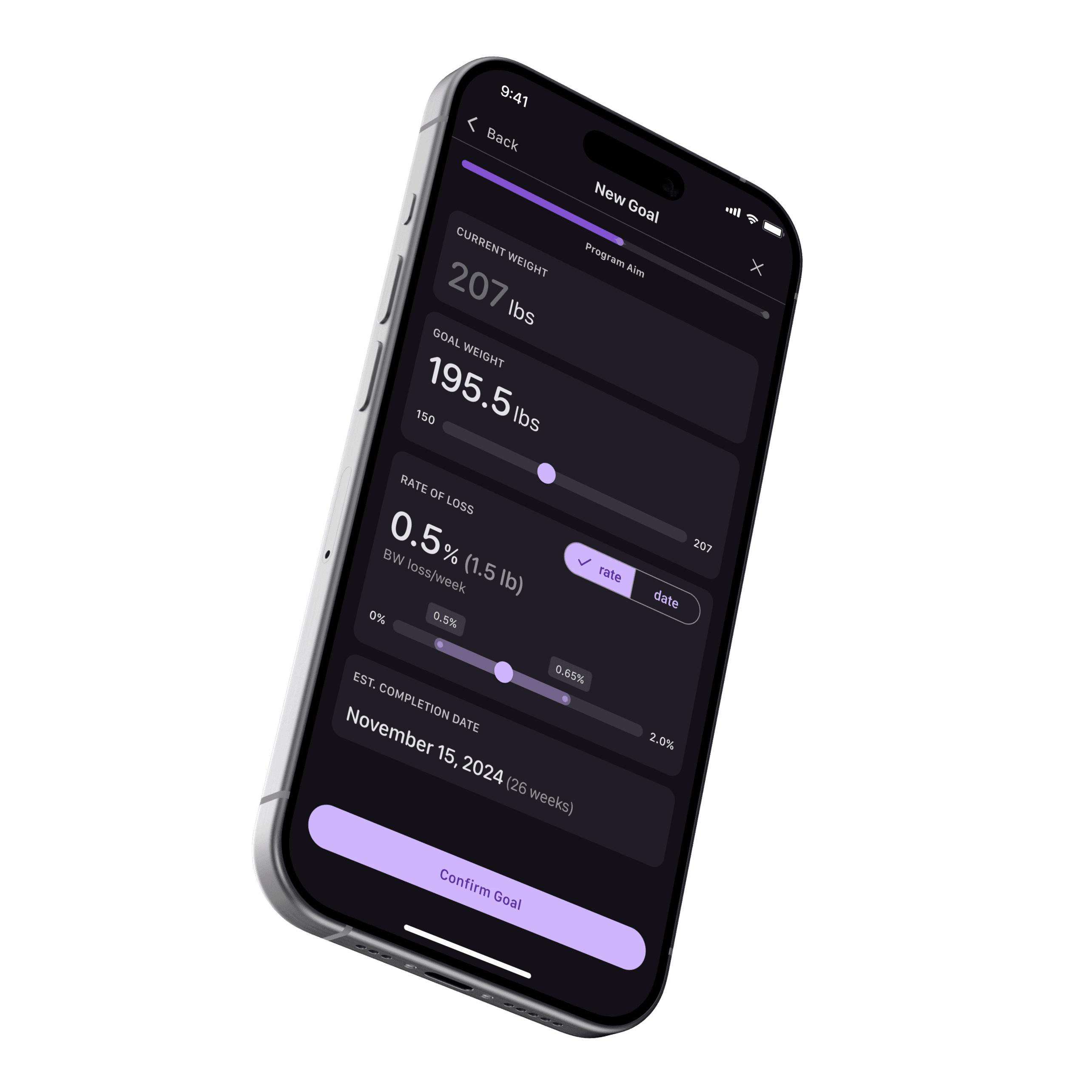
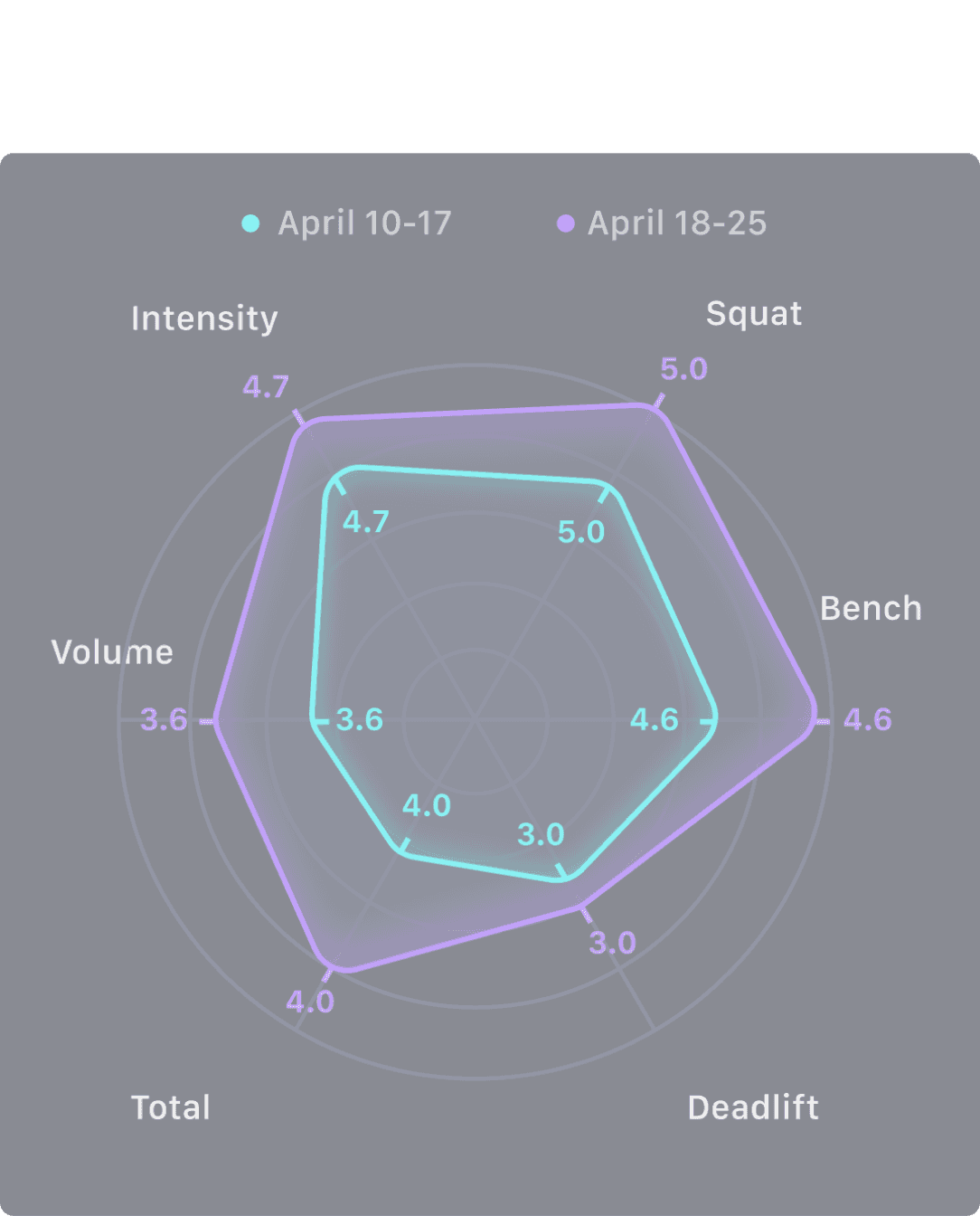
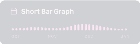
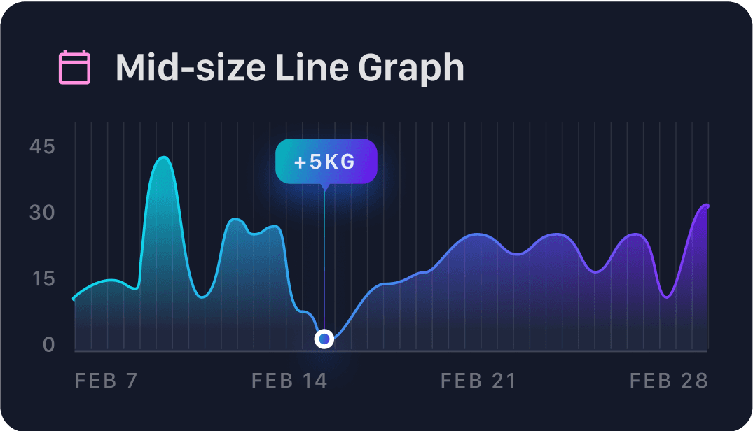
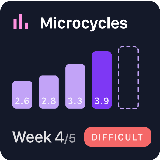
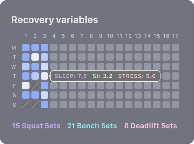
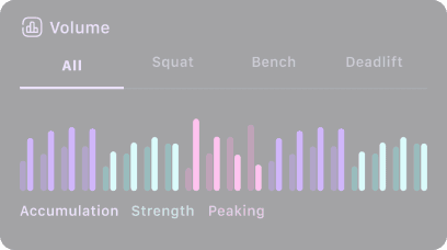
Advanced data analysis
For athletes who want the whole picture on their training.
This includes information on individual exercises and the program as a whole, digested into easy-to-understand visualizations.
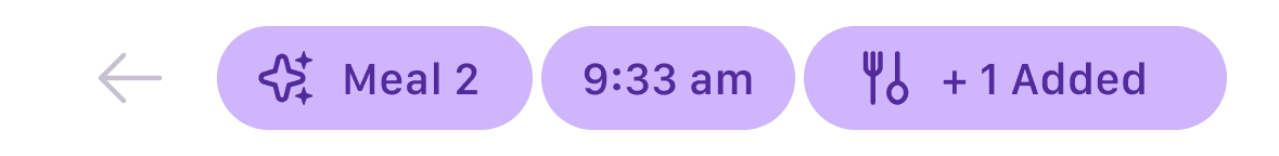
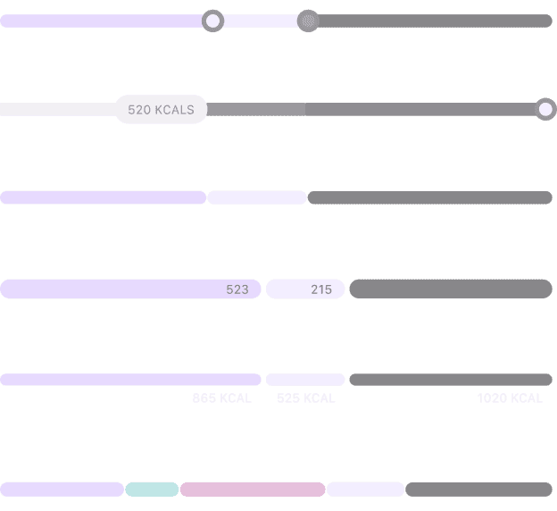
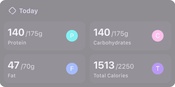
Completely redesigned nutrition
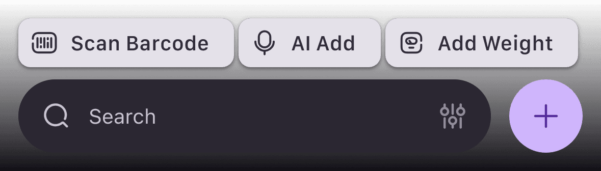
Focused on reducing the time to track foods
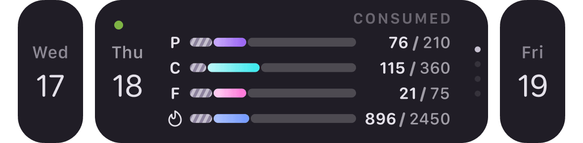
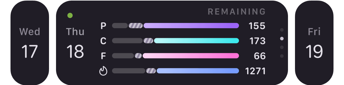
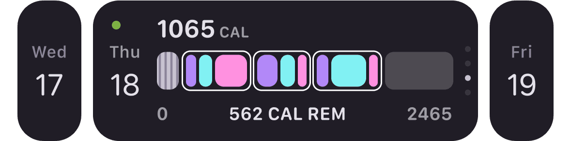
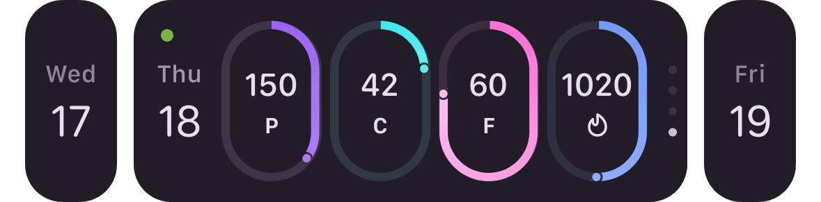
Page colors update to match the header image.
Settings
More than 50 new screens allow users to dig into settings to customize their training and nutrition experience.
Redesigned pre-training questionnaire

2 questions

9 questions

SIDE QUEST
White Labeling
Evolve was approached by a brand for white labeling which involved the creation of a new brand identity.
Branding
Early Concept
Barbell, ascent, path, journey
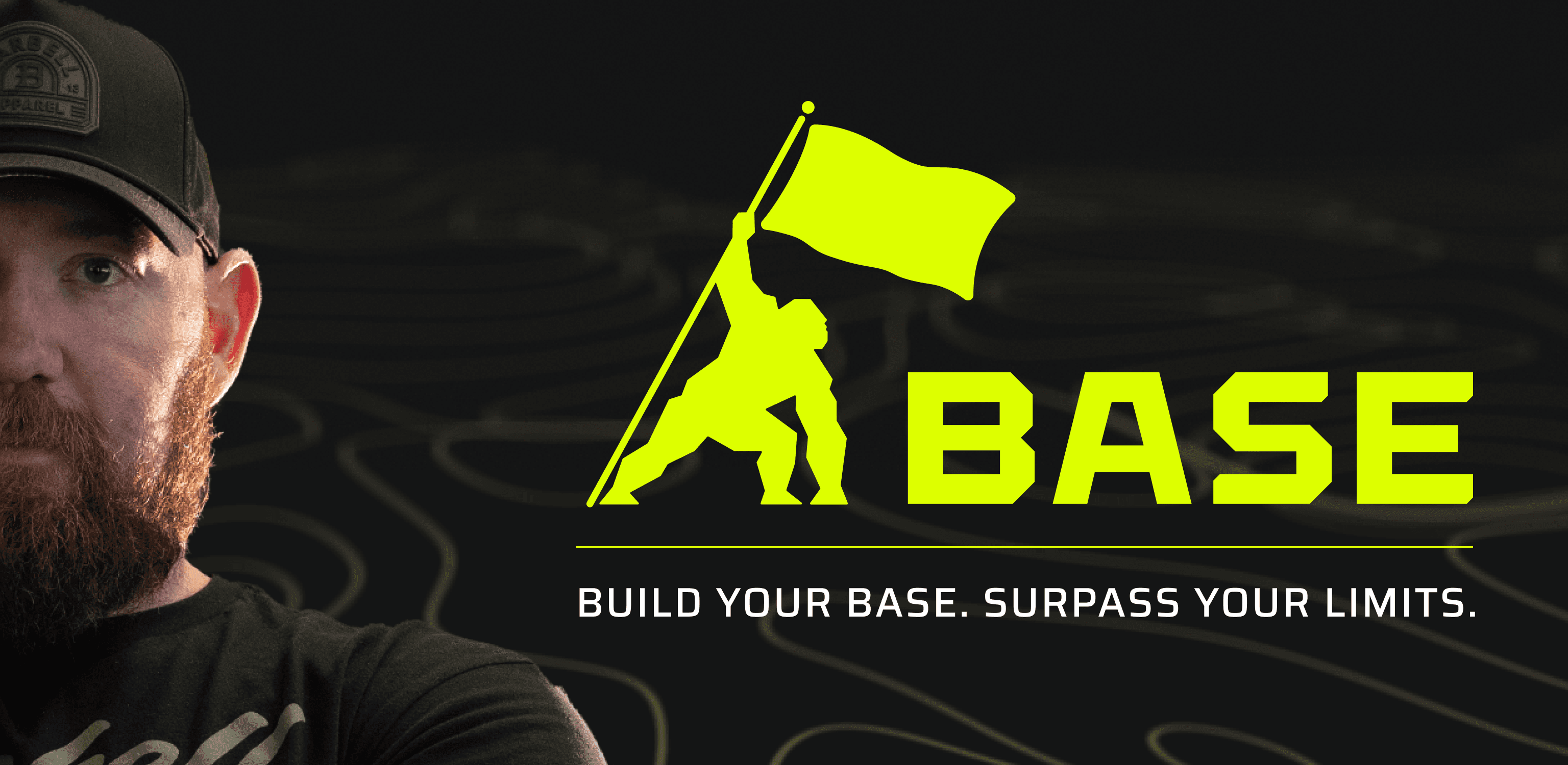
Final Branding
Gorilla, aggressive, bold, combat
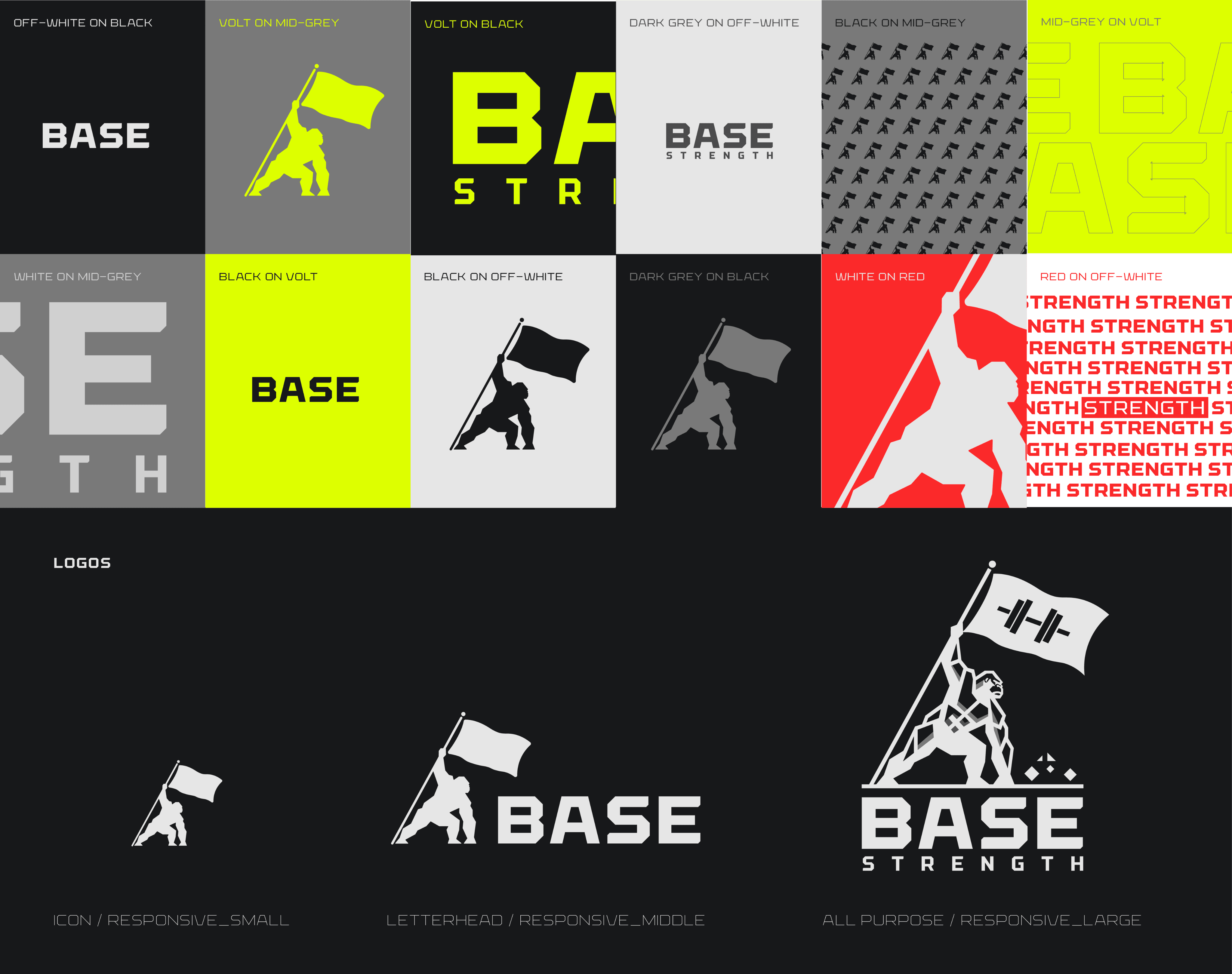
Colors
Completed White Label
Same same, but different
By setting up a complete design system in Figma and using their new token support, I was able to add modes to make screen-swapping much, much less time-consuming. From here, subtle tweaks allow me to optimize screens for readability and contrast.
(phew)
DESIGN PHASE
Testing and Iteration
Designs for components and screens went through many, many reivsions.
revisions


FINAL REFLECTIONS
Conclusion
Evolve's combination of training and data analytics lends itself well to the changes we made, keeping the user at the center of their journey.
Reflections & Lessons Learned
Walk & Talk
This was my first major project. I was able to see my design consistency, design software literacy and overall learning progress at a very fast rate, in real time. One of my biggest strengths is the ability to learn on the fly and adapt to new demands, and I saw that play out in the myriad problems I had to solve here.
Documentation
Design is nothing without documentation. When it comes to communicating with developers and upper management, being able to show your work and properly explain what needs to be developed (and how) are critical steps. The standardization and ongoing communication here set up a team for success in the long term.
Ideas Take Flight
A large part of my skill set is in thinking of new features and solving problems with novel solutions. While I’m aware that design systems establish consistency and predictability, sometimes creating something totally new is in order--new interactions, new ways to understand information, new ways to interact with your device. We have to continue creating and keep alive the spirit of play in the use of technology. There’s enough room in the scope of designing products to both
Small Screen Sizes
Designing for legacy devices is a necessary evil. Of course i’d be nice to design for the latest devices all the time, but that’s not the world we live in. Versioning and documentation are critical to the product development pipeline.
Constraints Increase Creativity
Most of the time, limiting suite of all possible options down to something more manageable increases creativity by giving boundaries structuring thought. It’s often where the best solutions come from.
Consistency
App-wide design consistency is a difficult thing to maintain. Even as I was the sole designer, I felt myself drift occasionally, leaning into something I saw or wanting to break from the default solution. Further documentation and totally compatible systems would help this.
Personal Note
I could not have asked for a better first start into the design world. I was given the opportunity to establish first principles at Evolve and create novel components and interactions. I was able to communicate with users and understand their experience, relay these experiences with management and advocate for users. We reduced attrition, opened up new revenue streams, and increased signup rates. I saw the impact of design on user satisfaction, solved problems and set a roadmap for future feature releases. I’m extremely thankful for the opportunity.