Electric Vehicle Dashboard
Optony, Inc.
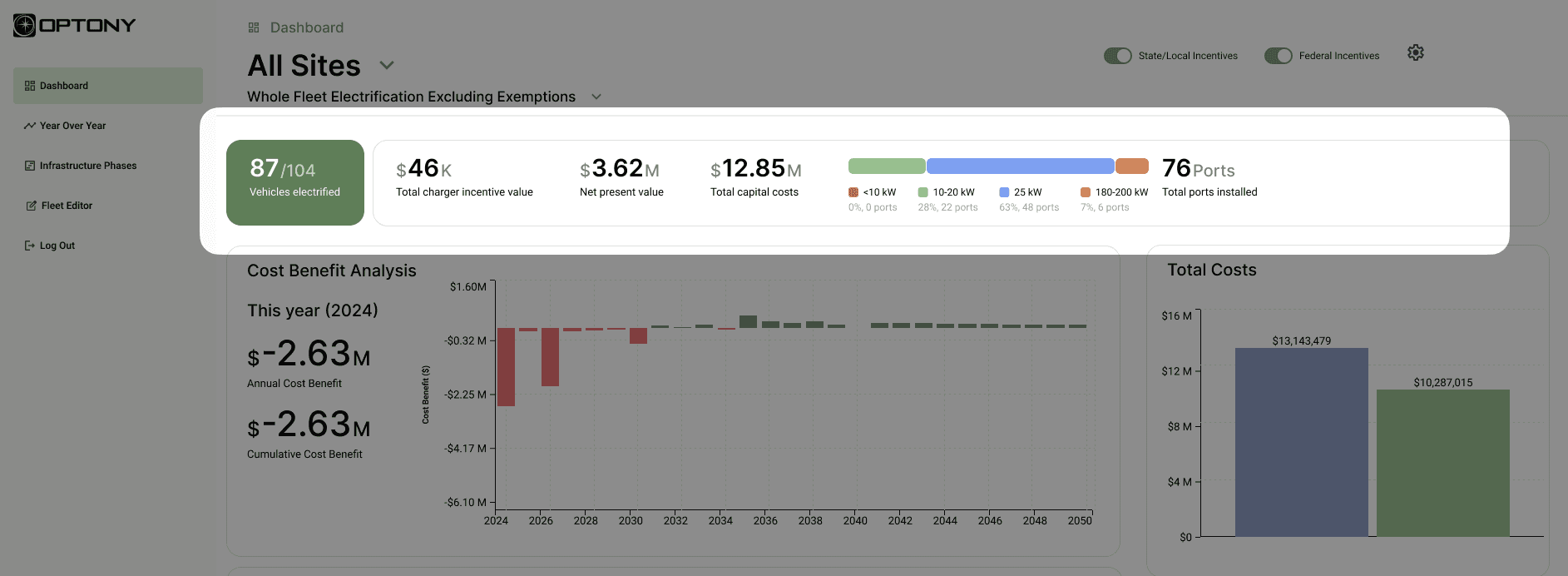
I completed a visual and experiential overhaul for an electric vehicle fleet management dashboard tool. Administrators use this dashboard to budget, track progress, and understand their fleet of vehicles.
Project Overview
Optony is a mid-sized consulting company hired to offer guidance on renewable projects, including solar installations and electric vehicle infrastructure and transition. They work primarily with municipalities, schools, airports, counties and cities, and utilities. Their work helps companies transition to renewable energy, significantly reducing their carbon footprint and contributing to a more sustainable world.
Project
EV fleet web app for ~200 vehicles and related data.
PROBLEM AREA
UI/UX overhaul, improve usability and presentation
ROLE
UI/UX Designer
DURATION
2 Weeks
TOOLS USED
Figma, iPad sketching, Notion
Original product screens were functional, but bare bones.
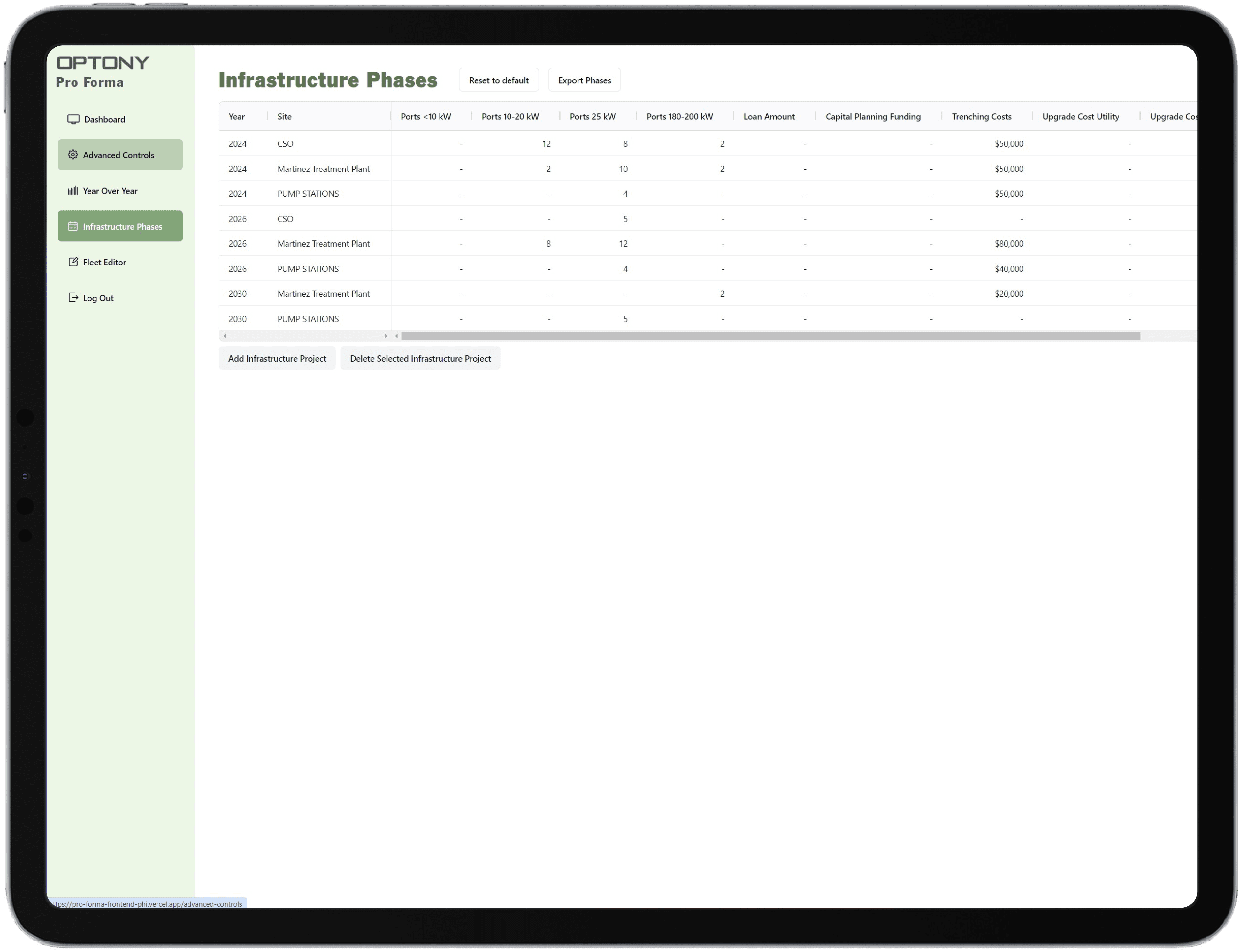
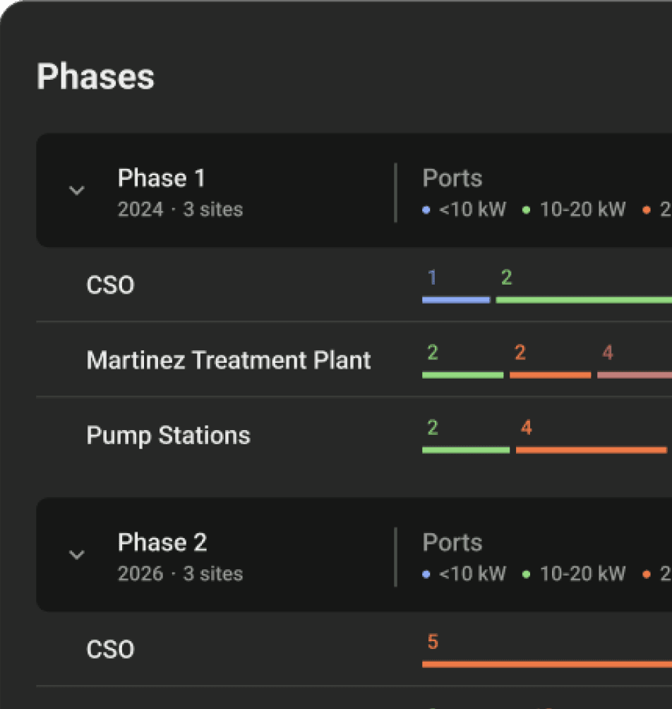
Infrastructure Phases attempts to group information by site, aggregating costs and other details while also allowing users to add or delete projects. Functionality and ability to parse data are very limited.

An inventory tab accounts for all vehicles and allows users the ability to add new vehicles. Missing are common table actions like filtering, sorting, and reordering.
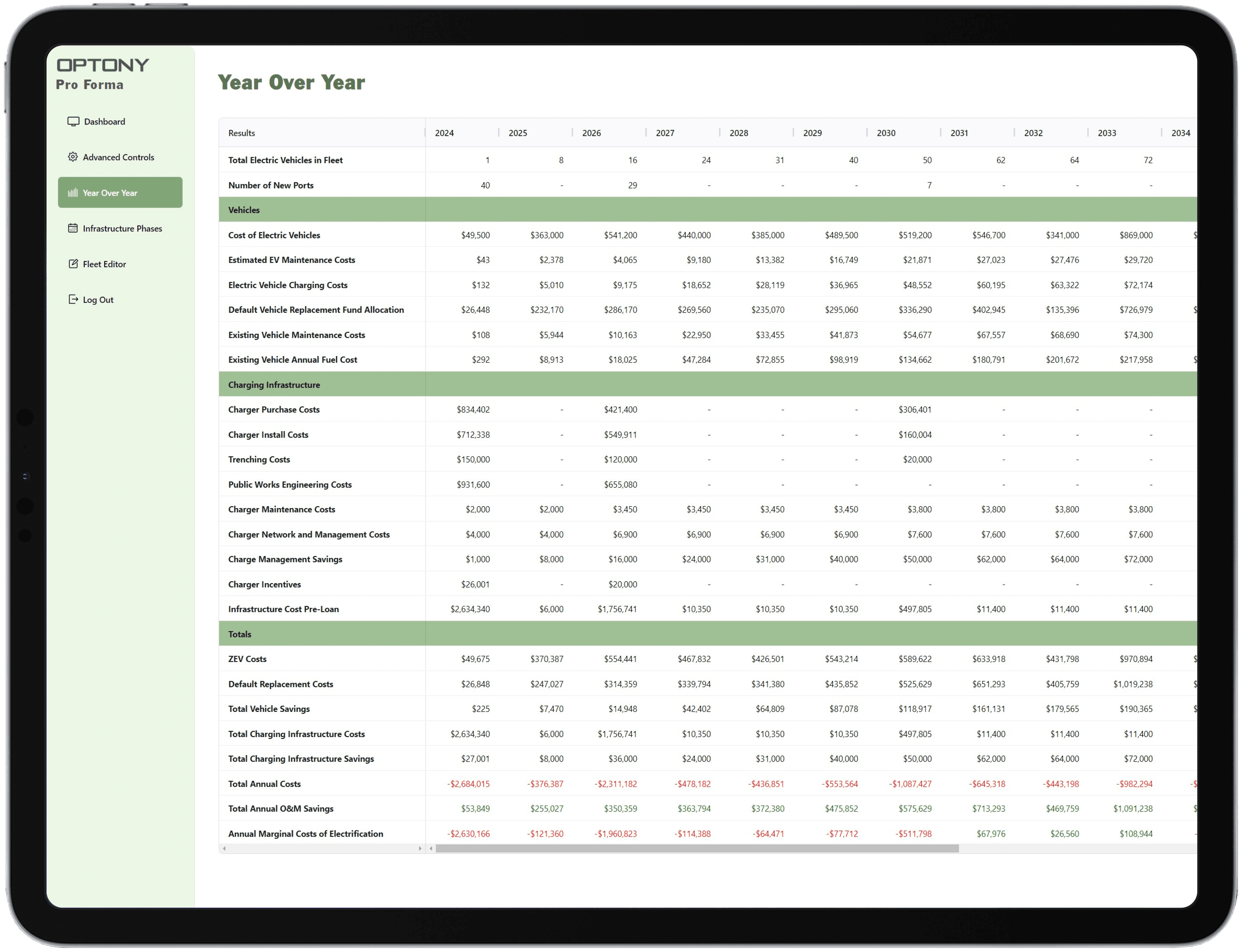
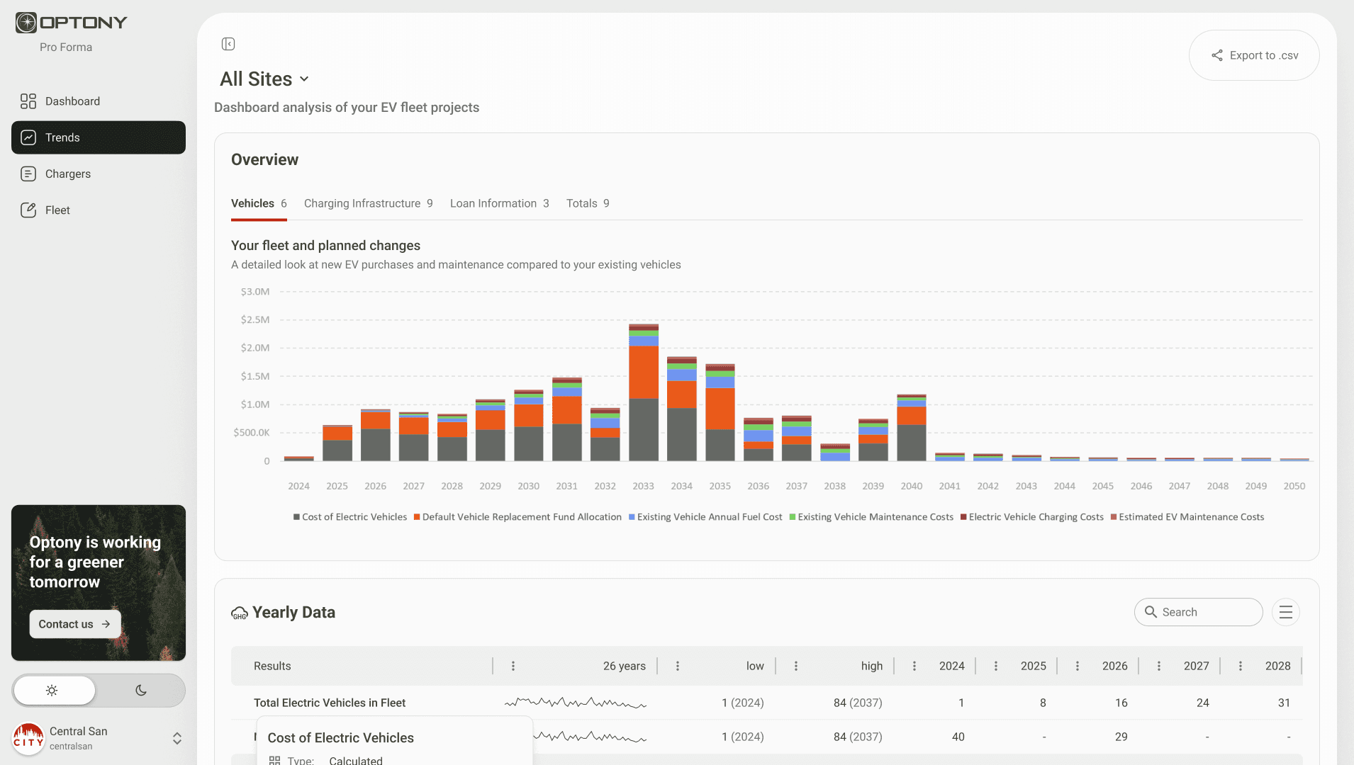
Year Over Year contains table data spanning 26 years into the future about EV fleets. There's a range of variables shown here, organized into groups. Primarily we see costs and quantities. It's hard to tell what patterns in the data exist without graphical representation.

A separate controls tab actually adjusts things on the dashboard. The inability to see the impact of your adjustments here violates Tesler's Law

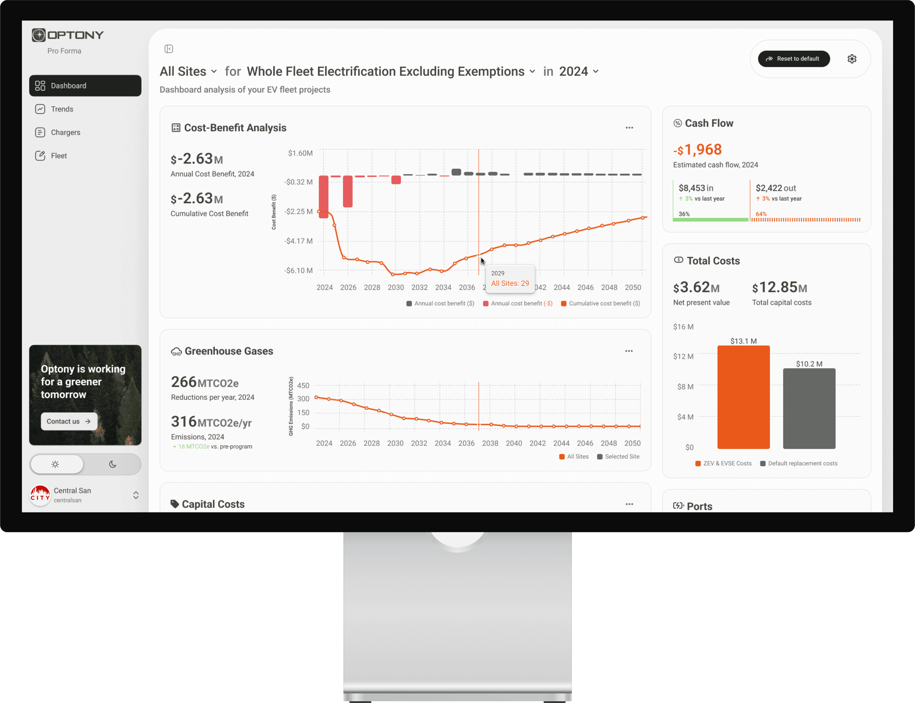
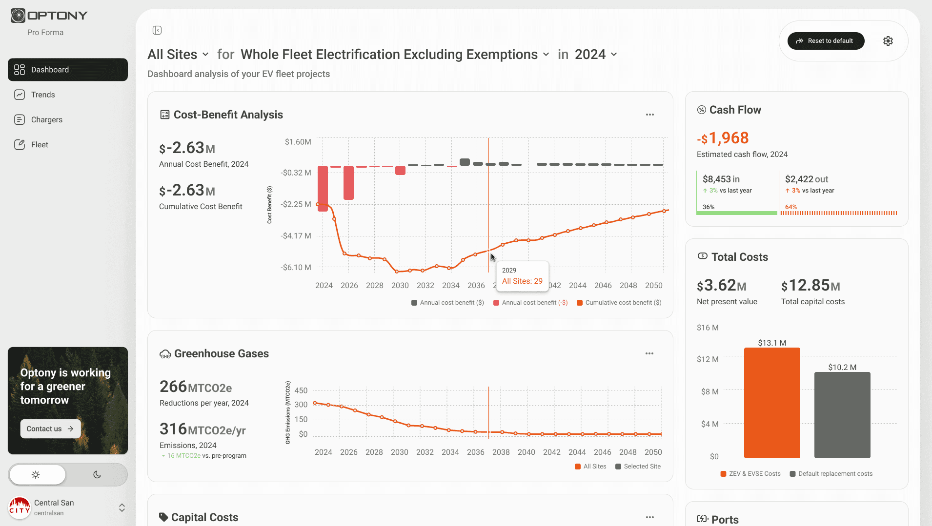
A main dashboard attempts to overview all information with added controls, but fails to give actionable insights. The top left space should be reserved for the most important data, now housing simple controls

Persona
User Review
Working with Optony’s team, I identified key characteristics of a typical user. This allowed me to focus in on a few key discoveries.
USER REVIEW
Major Discoveries
I began a critical appraisal of the design layout, annotating old designs and sketching new ones. Early on, I knew that a restructuring of the graphs would align information better and that certain numbers needed to be highlighted to make data consumption easier.
Here’s some of the insights that made their way into the completed project.
1
Expect the expected
The software must function similarly to the software they spend the majority of their day using.
Users don’t have time to learn new patterns of behavior.
see Jakob’s Law
2
Just the facts ma’am
Users need quick access to high level information they can take to their superiors for budgeting and status updates.
Presentable, digested information is a must.
3
Mind the p’s and q’s
Users have a hard time tracking grants and incentives from federal and state sources.
A good product highlights important dates to avoid things slipping through the cracks.
DESIGN PHASE
Prototyping
I began a critical appraisal of the design layout, annotating old designs and sketching new ones. Here’s some of the insights that informed the process and made their way into the completed project.
Visual Data Best Practices
Simplify and digest. Graphs and tables are paragraphs with numbers. We need to ensure users comprehend what they are seeing in a way that removes barriers.

Group related data
Based on the Gestalt Principle of Proximity, grouping related data eases comprehension.

Reduce numeric clutter
We don’t need to display all numeric values in a number. At a certain point, increased accuracy ($14,143,479) actually decreases our ability to understand information.
Most numbers in axes and other critical numbers were rounded to a point of maximal comprehension.
873295624.02583719648271639475402837591038475619205729103847928475610273648592018472910384726593847193847562019472835619482736192819384756104729183476573819475610283749574837261938475610293857291038479284756102736485920184729103847265938471938475620194728356194827361928193847561047291834765738194756102837495748372619384756102938
Reduce Redundancy
The site location for graphic data was repeated nine separate times on the dashboard. By utilizing principles of hierarchy, I was able to reduce this to one location without losing data comprehension
Remove unnecessary elements
Much of the center section of the previous designs took up more space than needed or didn’t serve a functional purpose. These were removed to streamline designs.
Information Hierarchy
Organization of information sets the foundation for understanding. Here’s the major steps I took.
Increase hierarchy
Since all text was a similar size and color, it’s hard to tell what is more or less important. I used text size, a thoughtful use of color, spacing, and font weight to make the dashboard easier to understand.
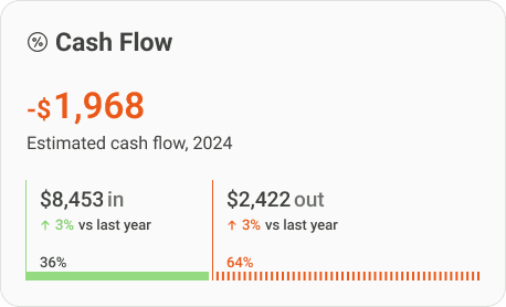
Rather than having users scan the charts for numbers, highlight and separate the most important numbers for easy access.


Alignment
By aligning multiple charts with the same x-axis, we allow for cross-chart comparisons.

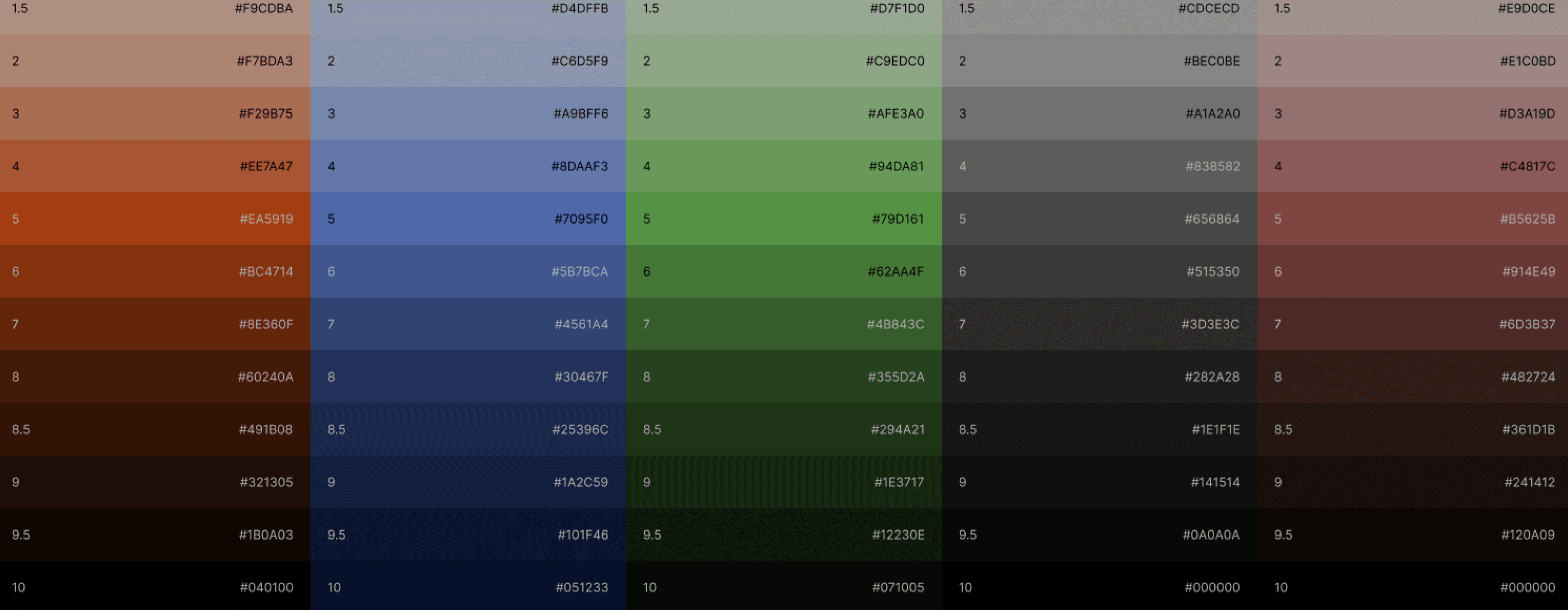
Color vibrancy and uniformity
Higher saturation. More colors. More shades. Utility colors.
UX Considerations
By deeply considering users’ experiences as they navigate the dashboard, I was able to modify the app to be more inclusive, more responsive, and with higher affordances.
Our Mission
A renewable future for all
Data Visualization
Clean data, clean mind
Climate Future Action Plan
Custodian of the planet
Accessibility
Previous designs did not pass AA contrast guidelines. This was amended.

Group interactive elements
There were controls in four separate locations. Grouping these together centralized dashboard customization.
Left to right, top to bottom
Reserve the top left for the most important information for Western countries.
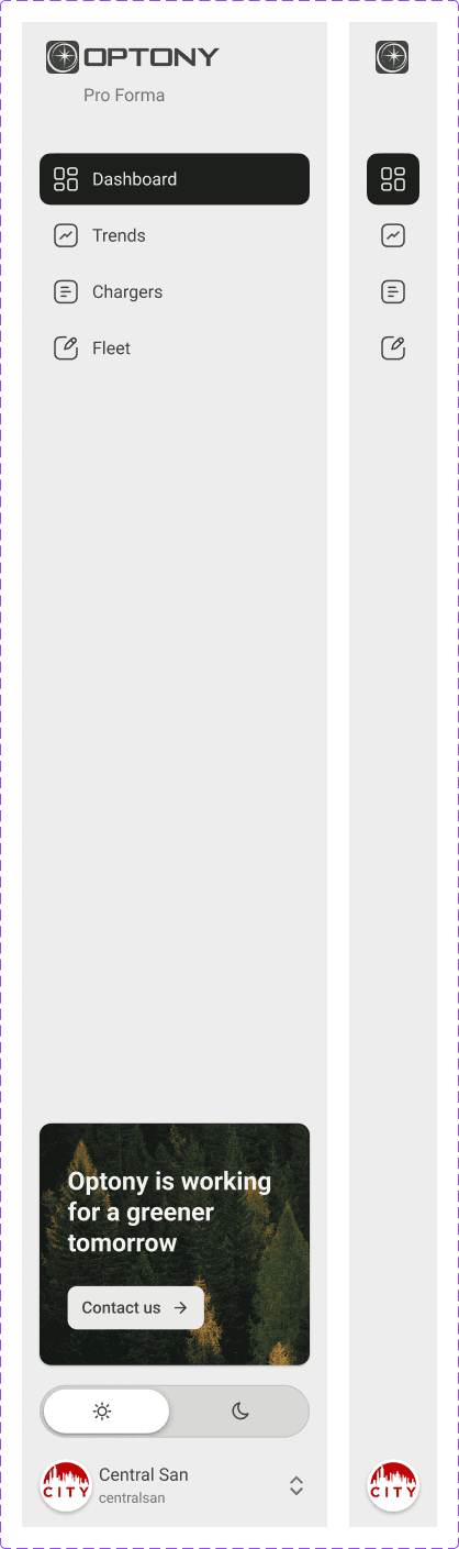
Collapsible sidebar
Maximize screen space on small laptops and tablets by minimizing navigation when not in use.
Dark mode
Many users want dark mode to reduce eye strain, especially for data-heavy applications.

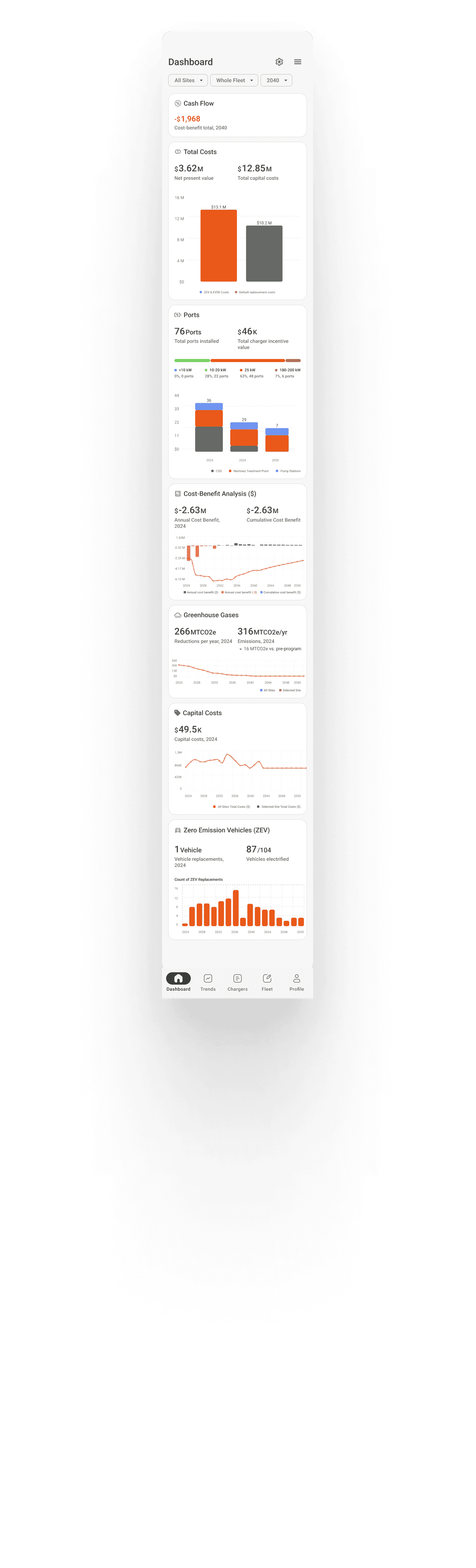
Mobile overhaul
While not requested, I created prototypes for mobile phones, completely reconfiguring all charts and tables.
Cost of Electric Vehicles
Type:
Calculated
Impact:
Moderate
Description:
Total sum cost of purchasing electric vehicles, including taxes and fees and blah lbah lbha.
Jargon begone
Explanations of complex terms increase data comprehension while sticking to industry terminology.
DESIGN PHASE
Design Deliverables
By deeply considering users’ experiences as they navigate the dashboard, I was able to modify the app to be more inclusive, more responsive, and with higher affordances.
optonyusa.com/dashboard

Testing & Iteration
Feedback
The design process was fluid with effective communication. Early designs features a status bar of sorts that was located at the top of the dashboard for a single, cohesive place to see relevant numbers. User feedback mentioned that these static numbers were not as helpful and should rather be grouped with their related data fields in contained sections of the dashboard.
FINAL REFLECTIONS
Conclusion
While my work on the project is completed, there’s an extensive roadmap that’s ready for Optony to pick up with, now set on a firm foundation
Reflections
Short Timeline
The product lifecycle can progress at a maddening rate. I came into this project late in its development and needed to provide nearly finished prototypes quickly so that the developer could continue working to meet his own deadline. At the same time, sometimes a tight timeline encourages the design process by lighting a fire, so to speak.
Lessons Learned
Lack of early design system standardization
Designs are often restricted by the functionality of libraries and APIs
function notImplemented(featureName) {
console.error(`Error: The feature "${creativeProcess}" is not available in this library.`);
throw new Error(`"${creativeProcess}" functionality does not exist.`);
}
Readability and data density often have an inverse relationship. It’s a balance.
When designing user interfaces, it's crucial to consider the accessibility and readability of text across different devices. Ensuring that all users, regardless of their vision capabilities, can comfortably read content is a priority. A common issue that arises is text that appears too small, which can lead to user frustration and decreased engagement. This text is too small, for instance, might be a frequent complaint if the font size is not adequately adjusted for mobile screens. By addressing these concerns early in the design process, developers can create more inclusive and user-friendly applications.
When designing user interfaces, it's crucial to consider the accessibility and readability of text across different devices. Ensuring that all users, regardless of their vision capabilities, can comfortably read content is a priority. A common issue that arises is text that appears too small, which can lead to user frustration and decreased engagement. This text is too small, for instance, might be a frequent complaint if the font size is not adequately adjusted for mobile screens. By addressing these concerns early in the design process, developers can create more inclusive and user-friendly applications.
Standard table design practices and interactive features
56px
16
16
16
16
Successes
It’s a win
The designs were met with great praise, especially given the short period of time I was able to work on this project. With a background and passion for data design, I feel I had a pre-existing idea of easy ways to improve upon a project like this. Further, I was able to suggest improvements and a roadmap that would carry this project into the future, effectively contributing both as designer and as product lead.
Collaboration
I met project goals and collaborated with the developer working on the project in a timely manner.
Better than before
I feel that I improved data comprehension and insight gathering and breathed life into a dashboard and product to promote greater client usability.
Future Work
Validate
Work needs to be done to validate the designs with users to receive feedback on comprehension of data, utility, accessibility, and features.
Interaction design
By utilizing microinteractions, we can more easily orient the user to common actions like drag and drop, adding new rows, filtering rows, and selecting from dropdowns. By adjusting component transition states with custom fades and spring states, we can create a beautiful and lasting product that keeps users coming back.
Dashboard customization
Often, even well-designed default dashboards don’t meet the needs of all users. By allowing for customization in graph location, type, complexity and subject would allow users to get more out of the product.
More advanced visualizations
A few pages were essentially tables that contained no visualizations. Useful insights and patterns were buried in the data, and I created visualizations above these to pull out helpful summaries. These need to be further refined and developed.
Fleet editor page needs interaction
Originally the Fleet page was called Fleet Editor, which would allow users to add vehicles to their fleet, or modify existing data. If the goal is to follow through with this functionality, care and attention must be taken to row interactions both for desktop and mobile versions.
Personal Note
This project only reinforced my love for making data come to life. What began as a routine electric vehicle fleet buildout data set became much more rich with the inclusion of thoughtful interaction and an eye to the intended purpose of data. When done correctly, data visualizations become second nature ways to understand the world around us. They are everywhere, we use data visualizations all day long.